Material Design is a Latest design language developed by Google. Material Design makes more liberal use of grid-based layouts, responsive animations and transitions, padding, and depth effects such as lighting and shadow.
Material Design is a Google’s conceptual design philosophy that outlines how apps should look and work on mobile devices. It breaks down everything — such as animation, style, layout- and gives guidance on patterns, components and usability. According to Google: “We challenged ourselves to create a visual language for our users that synthesizes the classic principles of good design with the innovation and possibility of technology and science. This is material design.”
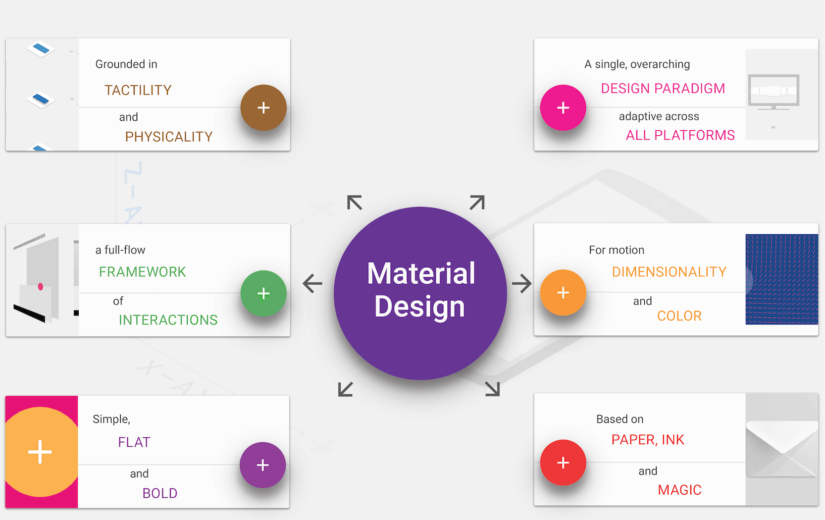
Material starts with mobile but extends to any other device. It is rooted in a few principles:
Realistic visual cues: The design is grounded in reality and actually inspired by design with paper and ink.
Bold, graphic and intentional: Fundamental design techniques drive the visuals. Typography, grids, space, scale, color and imagery guide the entire design. Elements live in defined spaces with a clear hierarchy. Color and type choices are bold and deliberate.
Motion provides meaning: Animation is a key component of Material Design, but it can’t just be there for the sake of movement. Animations need to happen in a single environment, serve to focus the design and include simple and easy transitions. Movements and actions should mirror the physical world.
Few points we need to understand about Material Design:
Understanding the “Tactile Surface”
One of the things that comes up a lot when talking about layered interfaces is the “tactile surface.”
Think of this as having multiple sheets of paper that are stacked together to create a framework for how everything within the design works. These sheets are a little different from physical sheets of paper in that they can change shape and form — such as stretch or bend — but work in a way that is seemingly realistic.
As explained in Mobile Design Trends for 2015, treat the tactile surface is a container for content and information. The container is flat in design but has a faint shadow to separate it from other containers and layers. Other techniques to create separation between layers – such as textures, gradients or strokes – are unnecessary.
As demonstrated in the Android Lollipop UI Kit, a tactile surface clearly established the relationship and function of content within a design. (Each container often has one job, such as a link or video player.) This approach also establishes depth, as elements in other containers are layered, creating a seemingly three-dimensional world.
Material is Made for Adaptive Design:
Layered interfaces are inherently made for adaptive design. All of the design guidelines actually encourage a designer to work with an adaptive layout (whether you prefer Adaptive or responsive is up for debate, however.)
When thinking about layered interfaces, it is important to consider how all the elements relate to one another.
Google recommends its standards because of a “flexible grid that ensures consistency across layouts, breakpoint details about how content reflows on different screens, and a description of how an app can scale from small to extra-large screens.”
Considerations include:
Breakpoints: Widths include 480, 600, 840, 960, 1280, 1440 and 1600 pixels.
Grid: 12-column layout with margins and gutters (8, 16, 24, or 40 pixels) and a baseline grid.
Surface behaviors: UI adapts to the type of screen so that surfaces are visible or toggled to hide.
Patterns: Function is based on screen size, including reveal, transform, expand, reflow and divide.
These considerations make it easy for designers to ensure their interfaces adapt for any device in any situation. They provide a baseline to help designers as they construct layouts for desktop, tablet and smartphone.
Material and Other Mobile Design Trends:
When it comes to creating layered interfaces, other trends also come into play.
Material Design looks nice and it works well in a variety of places. Designers will want to take advantage of that and the lite version provides the perfect level of guidance. Material Design Lite is also a good tool for designers and developers that want to create a unified web-app experience, so that apps look, feel and function in the same way regardless of device. Layers are definitely going to stick around, but the overall look may be a little more “layered” and a little less material, so that the design falls somewhere between Material Lite and iOS standards.
Gradients and monochromatic color layers are another way layered interfaces can continue to grow visually. Monochromatic color palettes are a classic design technique that make it easy to create sharp elements to fit almost any type of content.
The Elevate iOS app uses a gradient background with multiple levels of cards in its design. The animations and movements are very Material Design in nature but the use of a gradient is not. This simple evolution highlights how designers will start to break the visual rules of layered interfaces while continuing to leverage its more functional aspects.
Designers will continue to evolve layered interfaces and Material Design concepts with darker colors and hues. Most of the apps available right now feature light and white color schemes, but darker colors will start to emerge. Weather Timeline is a perfect example of this. The simple change to the color palette is enough to really make this app stand out from all the others available. It still uses a style that’s distinctly layered, but the darker interface is simple and elegant. The colors for the entire design are less saturated and toned to match the darker aesthetic.
Today’s layered interfaces are just the start. The simple visual style and high usability of this design style will continue to emerge and grow as designers — not just for Android — will latch on the concepts. What may be even more interesting is that the look of layered interfaces is really just an extension of a lot of the design techniques that have been growing in popularity for several years, including flat and minimalism.
At some point the pendulum may swing back to more “realistic-looking” interfaces, but until then this concept appears to have quite the foothold.
Mantra Labs deep dives into latest trends and innovations in the Web, Mobile, Enterprise and Internet of Things space. The insights generated from these studies helps us provide more value for our clients.
Guest written by P. Sudhakar, our ace Design Lead.
Interfaces are everywhere. The user experience encompasses the overall experience a user has while interacting…
Analytics are essential for informing website redesigns since they offer insightful data on user behavior,…
The Digital Transformation In the Energy Sector In the United States, a notable transformation is…
In the realm of pharmaceuticals, the digital revolution is not just a buzzword; it's a…
Welcome to a world of customer experience evolution where technology and humans sync fluidly, to…
The importance of customer experience (CX) in healthcare cannot be overstated. A positive CX is…
This website uses cookies.