


Published on Apr 20, 2023
Updated on Apr 25, 2023
Create superior customer experiences to enhance competitive advantage.
Go from zero to breakthrough with scalable, future-proof solutions.
Harness deep tech for smarter solutions and maximum impact.
Accelerate value delivery with powerful pre-built digital tools.
Help businesses connect with an internet first generation.
Test the smarter way: where precision meets efficiency.
Unlock real-time and personalized customer journeys for mobile first generation.
Turn data into decisive action with scalable AI infrastructure.
Design agile digital foundations that scale with tomorrow's business needs.
Build new-age architecture for maximum efficiency and hyper-growth.
Fine-tune your cloud infrastructure for peak performance.
Automated compliance and control for global regulations.

All
Customer Experience
Mantra
Application Development
Insurtech
Digital Health
Insurance
Deep-Tech
AgriTech(1)
Augmented Reality(21)
Clean Tech(9)
Customer Journey(17)
Design(45)
Solar Industry(8)
User Experience(68)
Edtech(10)
Events(34)
HR Tech(3)
Interviews(10)
Life@mantra(11)
Logistics(6)
Manufacturing(5)
Strategy(18)
Testing(9)
Android(48)
Backend(32)
Dev Ops(11)
Enterprise Solution(33)
Technology Modernization(9)
Frontend(29)
iOS(43)
Javascript(15)
AI in Insurance(41)
Insurtech(67)
Product Innovation(59)
Solutions(22)
E-health(12)
HealthTech(25)
mHealth(5)
Telehealth Care(4)
Telemedicine(5)
Artificial Intelligence(154)
Bitcoin(8)
Blockchain(19)
Cognitive Computing(8)
Computer Vision(8)
Data Science(24)
FinTech(51)
Banking(7)
Intelligent Automation(27)
Machine Learning(48)
Natural Language Processing(14)
We have been ingrained with a lot of rules and regulations since our childhood. And out of curiosity, whenever we asked why, the answer was- some traditions and customs must be followed…😤
And this didn’t end there, even in UI/UX too, the same is followed even today.
So many rules and no clear explanation of Why.❓
In this blog, we’ll try to understand the reasons why certain guidelines must be followed when designing. For example, why we shouldn’t use red background on blue and vice-versa? Why button should have a certain touch area? And so on.
To begin with, the majority of the rules related to the design are actually connected with how the human body is structured or as we call it, Designed. Not clear? We’ll go one by one discussing the reasons behind most widely used 6 rules.
The choice of font color and the background color is usually based on factors such as contrast, legibility, and aesthetic appeal. However, it is important to ensure that the combination of colors provides good contrast, making the text easy to read. But why is it hard to read?
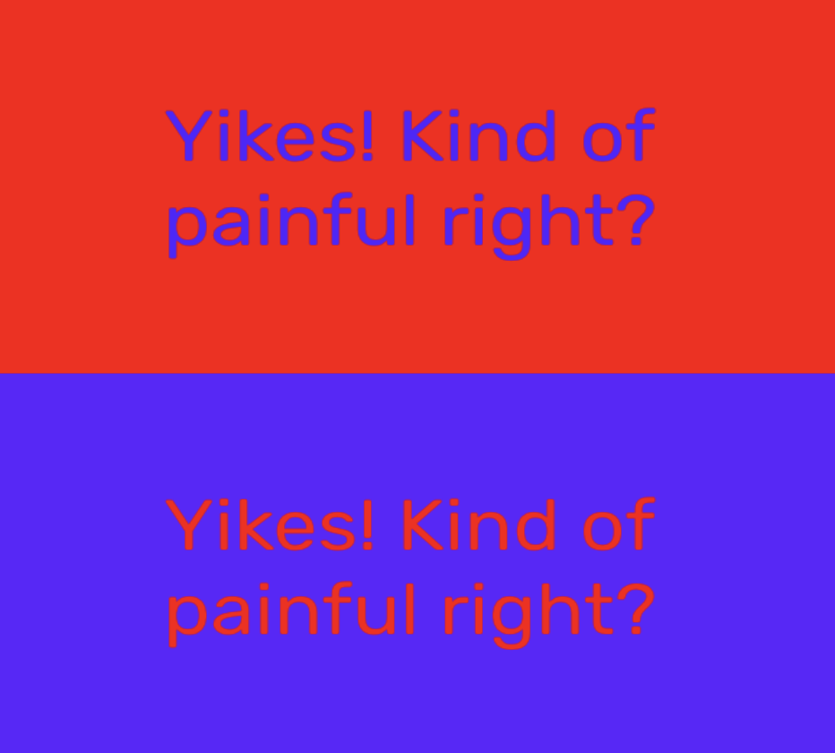
This occurs because of Chromostereopsis, which is a visual illusion that happens when certain colors are placed next to each other, making it unnecessarily difficult to stay focused on both colors. The illusion is due to the stimulating of different areas within the eye, causing some light rays to coincide with others in the eye. Because of this, it becomes difficult for the human eye to focus on them.
Don’t let users remember!
As a designer, we should always try to reduce the user’s memory load by keeping objects, actions, and options visible. The user shouldn’t have to recall details from one section of the dialogue to the next.
Why?
Because of short-term memory.
The majority of the information in short-term memory will be stored only for about 20 to 30 seconds, or even less, and can last for up to just a minute.
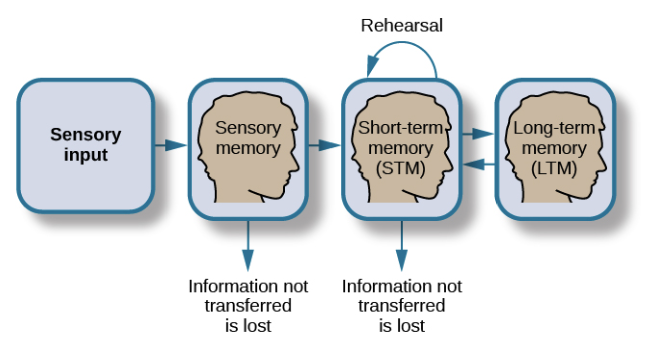
Most information decays quickly, unless we rehearse it. We remember 7 things, +/- 2 in short-term memory. Recent research shows a decrease to 4 things +/- 1.
That’s how our brain is designed. So it becomes hard for the users to remember information, it’s always best to recognize the information than recalling.
Oops! I forgot which account number I selected 🤯😶🌫️
The button size should not be less than 42 pixels(not a hard and fast rule). This is not because of visual appeal, balance, etc., but because of the thumb/ finger touch area. The smaller the size, difficult it becomes for the user to perform actions using the button or icons in that case. And larger items are easy to see.
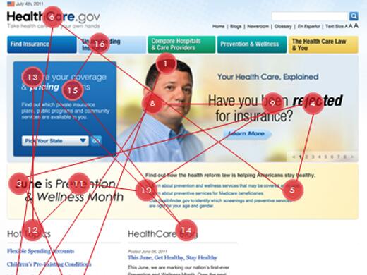
The brain assembles a continuous visual experience from a sequence of fixations and saccades, making vision continuous. Fixation is the location at which our eyes fixate and a saccade is a fast, simultaneous movement of both eyes between two or more phases of fixation in the same direction.
Things that attract the scan are bright colors, big numbers, people, etc.
Too many fixations make it difficult to scan through the design, it recreates too much cognitive load. So we have to reduce eye fluctuation to keep the focus and to get the work done easily and efficiently.
Ever wonder why floating icons are on the right end of the phone? This is because of the way people naturally read and scan content. The floating icon concept is connected with how our motors (hands) and eyes function. In many cultures, people read and scan content from left to right. This means that their eyes are more likely to start on the left side of the screen and move toward the right. And also most Indians are right-handed and the right end is the easiest area to be accessed while using the phone. Anywhere on the top becomes difficult to access.
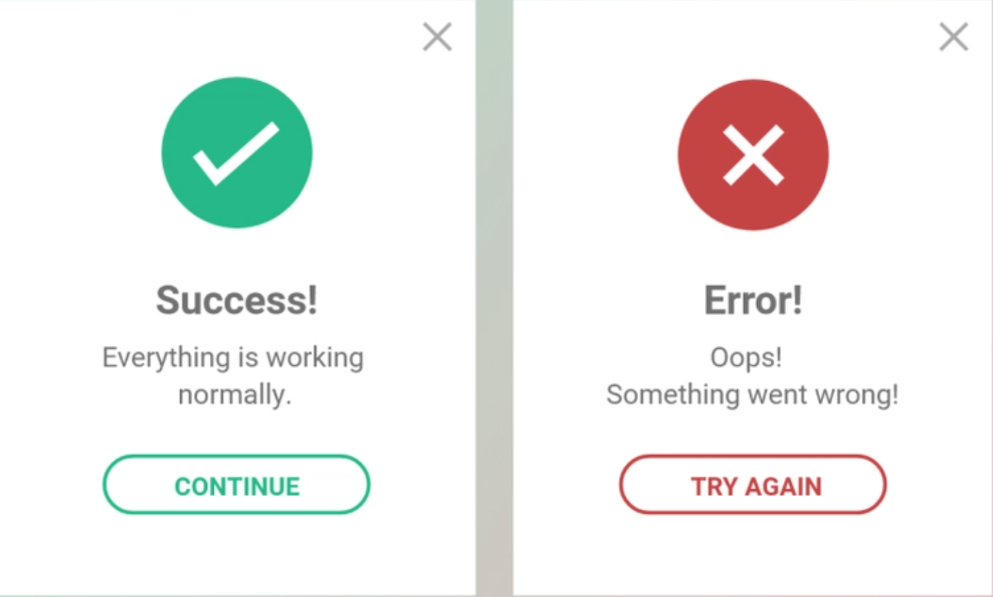
The use of green and red colors to represent success and alert respectively is commonly used in user interface design. This is based on the psychological associations that people tend to have with these colors. Green is often associated with positive emotions such as growth, harmony, and success, while red is associated with danger, warning, and urgency.
And in the real world, the traffic signal-go is green, and the stop is red. Using the same color for success and alert becomes easy to associate with less or no cognitive load.
These are just a few whys and they are many more. Learning the why behind these rules may help in making work more meaningful and becoming a good designer.
Hope you found this article helpful.
Want to know more about designing?
Read our blog: Iteration Leads to powerful results in Design
About the Author:
Charishma is a UI/UX designer at Mantra Labs, who believes in creating experiences that matter. She is an MBA turned designer who fell in love with the process of how design is made.
Knowledge thats worth delivered in your inbox
Smart Manufacturing starts with real-time visibility.
Manufacturing companies today generate data by the second through sensors, machines, ERP systems, and MES platforms. But without real-time insights, even the most advanced production lines are essentially flying blind.
Manufacturers are implementing real-time dashboards that serve as control towers for their daily operations, enabling them to shift from reactive to proactive decision-making. These tools are essential to the evolution of Smart Manufacturing, where connected systems, automation, and intelligent analytics come together to drive measurable impact.
Data is available, but what’s missing is timely action.
For many plant leaders and COOs, one challenge persists: operational data is dispersed throughout systems, delayed, or hidden in spreadsheets. And this delay turns into a liability.
Real-time dashboards help uncover critical answers:
By converting raw inputs into real-time manufacturing analytics, dashboards make operational intelligence accessible to operators, supervisors, and leadership alike, enabling teams to anticipate problems rather than react to them.
Line performance and downtime trends
Track OEE in real time and identify underperforming lines.
Predictive maintenance alerts
Utilize historical and sensor data to identify potential part failures in advance.
Inventory heat maps & reorder thresholds
Anticipate stockouts or overstocks based on dynamic reorder points.
Quality metrics linked to operator actions
Isolate shifts or procedures correlated with spikes in defects or rework.
These insights allow production teams to drive day-to-day operations in line with Smart Manufacturing principles.
Role-based dashboards
Dashboards can be configured for machine operators, shift supervisors, and plant managers, each with a tailored view of KPIs.
Embedded alerts and nudges
Real-time prompts, like “Line 4 below efficiency threshold for 15+ minutes,” reduce response times and minimize disruptions.
Cross-functional drill-downs
Teams can identify root causes more quickly because users can move from plant-wide overviews to detailed machine-level data in seconds.
Data lakehouse integration
Unified access to ERP, MES, IoT sensor, and QA systems—ensuring reliable and timely manufacturing analytics.
ETL pipelines
Real-time data ingestion from high-frequency sources with minimal latency.
Visualization tools
Custom builds using Power BI, or customized solutions designed for frontline usability and operational impact.
Mantra Labs partnered with a North American die-casting manufacturer to unify its operational data into a real-time dashboard. Fragmented data, manual reporting, delayed pricing decisions, and inconsistent data quality hindered operational efficiency and strategic decision-making.
As this case shows, real-time dashboards are not just operational tools—they’re strategic enablers.
(Learn More: Powering the Future of Metal Manufacturing with Data Engineering)
| Aspect | What You Should Know |
| 1. Why Static Reports Fall Short | Delayed insights after issues occur Disconnected systems (ERP, MES, sensors) No real-time alerts or embedded decision logic |
| 2. What Real-Time Dashboards Enable | Track OEE and downtime in real-time Predictive maintenance using sensor data Dynamic inventory heat maps Quality linked to operators |
| 3. Dashboards That Drive Action | Role-based views (operator to CEO) Embedded alerts like “Line 4 down for 15+ mins” Drilldowns from plant-level to machine-level |
| 4. What Powers These Dashboards | Unified Data Lakehouse (ERP + IoT + MES) Real-time ETL pipelines Power BI or custom dashboards built for frontline usability |
Smart Manufacturing dashboards aren’t just analytics tools—they’re productivity engines. Dashboards that deliver real-time insight empower frontline teams to make faster, better decisions—whether it’s adjusting production schedules, triggering preventive maintenance, or responding to inventory fluctuations.
Explore how Mantra Labs can help you unlock operations intelligence that’s actually usable.
Knowledge thats worth delivered in your inbox


Our Sales Team will be in touch with you shortly.

Hello Stranger! Please fill in a few details,and you’ll receive a link to this case study.
 We have mailed you this case study.
Thanks for subscribing.
