


Published on Apr 12, 2016
Updated on Oct 16, 2019
Create superior customer experiences to enhance competitive advantage.
Go from zero to breakthrough with scalable, future-proof solutions.
Harness deep tech for smarter solutions and maximum impact.
Accelerate value delivery with powerful pre-built digital tools.
Help businesses connect with an internet first generation.
Test the smarter way: where precision meets efficiency.
Unlock real-time and personalized customer journeys for mobile first generation.
Turn data into decisive action with scalable AI infrastructure.
Design agile digital foundations that scale with tomorrow's business needs.
Build new-age architecture for maximum efficiency and hyper-growth.
Fine-tune your cloud infrastructure for peak performance.

All
Customer Experience
Mantra
Application Development
Insurtech
Digital Health
Insurance
Deep-Tech
AgriTech(1)
Augmented Reality(21)
Clean Tech(9)
Customer Journey(17)
Design(45)
Solar Industry(8)
User Experience(68)
Edtech(10)
Events(34)
HR Tech(3)
Interviews(10)
Life@mantra(11)
Logistics(6)
Manufacturing(3)
Strategy(18)
Testing(9)
Android(48)
Backend(32)
Dev Ops(11)
Enterprise Solution(33)
Technology Modernization(9)
Frontend(29)
iOS(43)
Javascript(15)
AI in Insurance(39)
Insurtech(67)
Product Innovation(59)
Solutions(22)
E-health(12)
HealthTech(24)
mHealth(5)
Telehealth Care(4)
Telemedicine(5)
Artificial Intelligence(153)
Bitcoin(8)
Blockchain(19)
Cognitive Computing(8)
Computer Vision(8)
Data Science(23)
FinTech(51)
Banking(7)
Intelligent Automation(27)
Machine Learning(48)
Natural Language Processing(14)
Material Design is a Latest design language developed by Google. Material Design makes more liberal use of grid-based layouts, responsive animations and transitions, padding, and depth effects such as lighting and shadow.
Material Design is a Google’s conceptual design philosophy that outlines how apps should look and work on mobile devices. It breaks down everything — such as animation, style, layout- and gives guidance on patterns, components and usability. According to Google: “We challenged ourselves to create a visual language for our users that synthesizes the classic principles of good design with the innovation and possibility of technology and science. This is material design.”
Material starts with mobile but extends to any other device. It is rooted in a few principles:
Realistic visual cues: The design is grounded in reality and actually inspired by design with paper and ink.
Bold, graphic and intentional: Fundamental design techniques drive the visuals. Typography, grids, space, scale, color and imagery guide the entire design. Elements live in defined spaces with a clear hierarchy. Color and type choices are bold and deliberate.
Motion provides meaning: Animation is a key component of Material Design, but it can’t just be there for the sake of movement. Animations need to happen in a single environment, serve to focus the design and include simple and easy transitions. Movements and actions should mirror the physical world.
Few points we need to understand about Material Design:
Understanding the “Tactile Surface”
One of the things that comes up a lot when talking about layered interfaces is the “tactile surface.”
Think of this as having multiple sheets of paper that are stacked together to create a framework for how everything within the design works. These sheets are a little different from physical sheets of paper in that they can change shape and form — such as stretch or bend — but work in a way that is seemingly realistic.
As explained in Mobile Design Trends for 2015, treat the tactile surface is a container for content and information. The container is flat in design but has a faint shadow to separate it from other containers and layers. Other techniques to create separation between layers – such as textures, gradients or strokes – are unnecessary.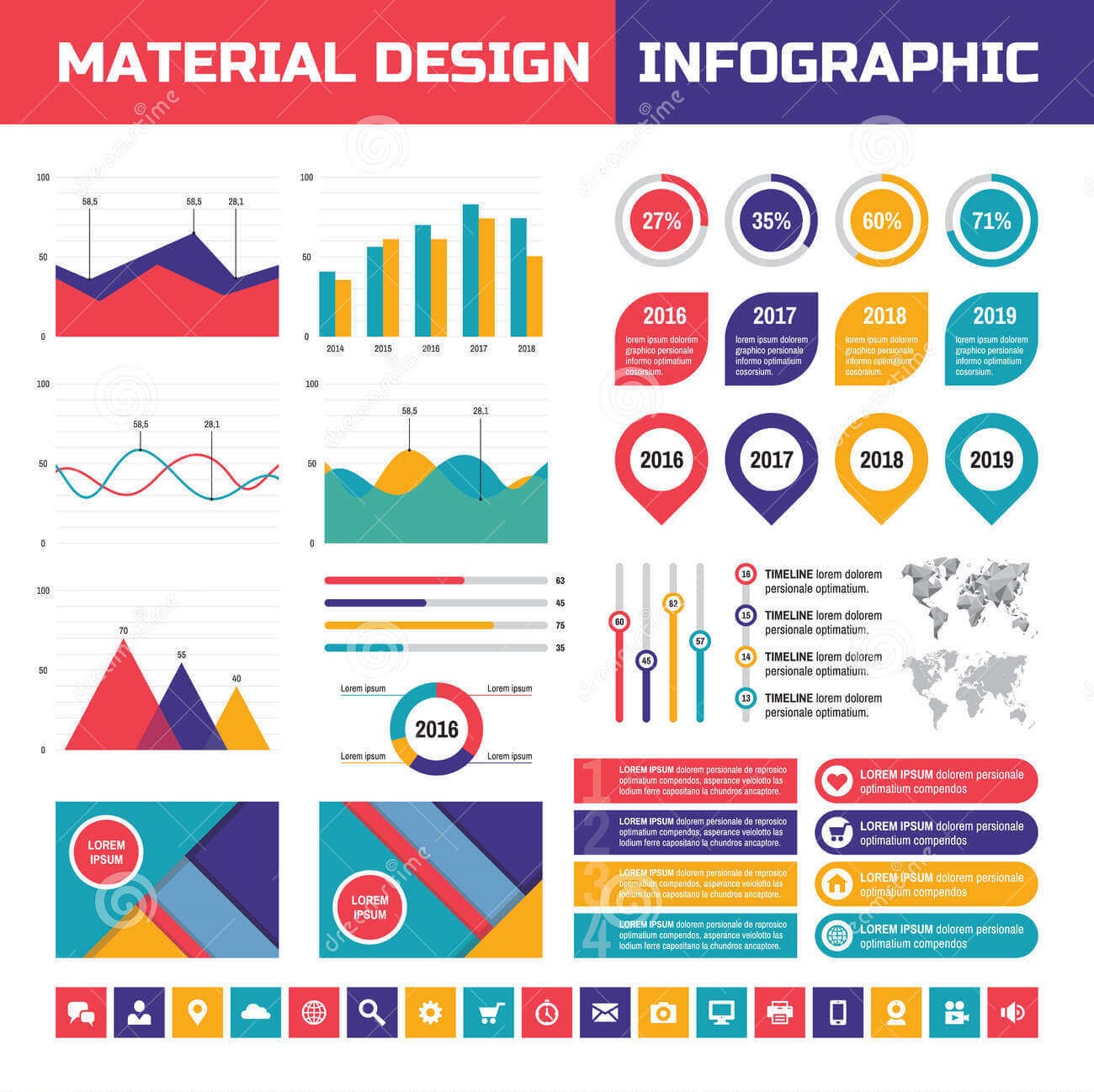 You can see the separation in the layers for the Reddit app, above. There is an obvious top menu layer covering a greyed out main content layer. Even the main header image contains elements of layering and shading that emphasize a three-dimensional tactile surface.
As demonstrated in the Android Lollipop UI Kit, a tactile surface clearly established the relationship and function of content within a design. (Each container often has one job, such as a link or video player.) This approach also establishes depth, as elements in other containers are layered, creating a seemingly three-dimensional world.
Material is Made for Adaptive Design:
Layered interfaces are inherently made for adaptive design. All of the design guidelines actually encourage a designer to work with an adaptive layout (whether you prefer Adaptive or responsive is up for debate, however.)
When thinking about layered interfaces, it is important to consider how all the elements relate to one another.
Google recommends its standards because of a “flexible grid that ensures consistency across layouts, breakpoint details about how content reflows on different screens, and a description of how an app can scale from small to extra-large screens.”
Considerations include:
Breakpoints: Widths include 480, 600, 840, 960, 1280, 1440 and 1600 pixels.
Grid: 12-column layout with margins and gutters (8, 16, 24, or 40 pixels) and a baseline grid.
Surface behaviors: UI adapts to the type of screen so that surfaces are visible or toggled to hide.
Patterns: Function is based on screen size, including reveal, transform, expand, reflow and divide.
These considerations make it easy for designers to ensure their interfaces adapt for any device in any situation. They provide a baseline to help designers as they construct layouts for desktop, tablet and smartphone.
Material and Other Mobile Design Trends:
When it comes to creating layered interfaces, other trends also come into play.
Material Design looks nice and it works well in a variety of places. Designers will want to take advantage of that and the lite version provides the perfect level of guidance. Material Design Lite is also a good tool for designers and developers that want to create a unified web-app experience, so that apps look, feel and function in the same way regardless of device. Layers are definitely going to stick around, but the overall look may be a little more “layered” and a little less material, so that the design falls somewhere between Material Lite and iOS standards.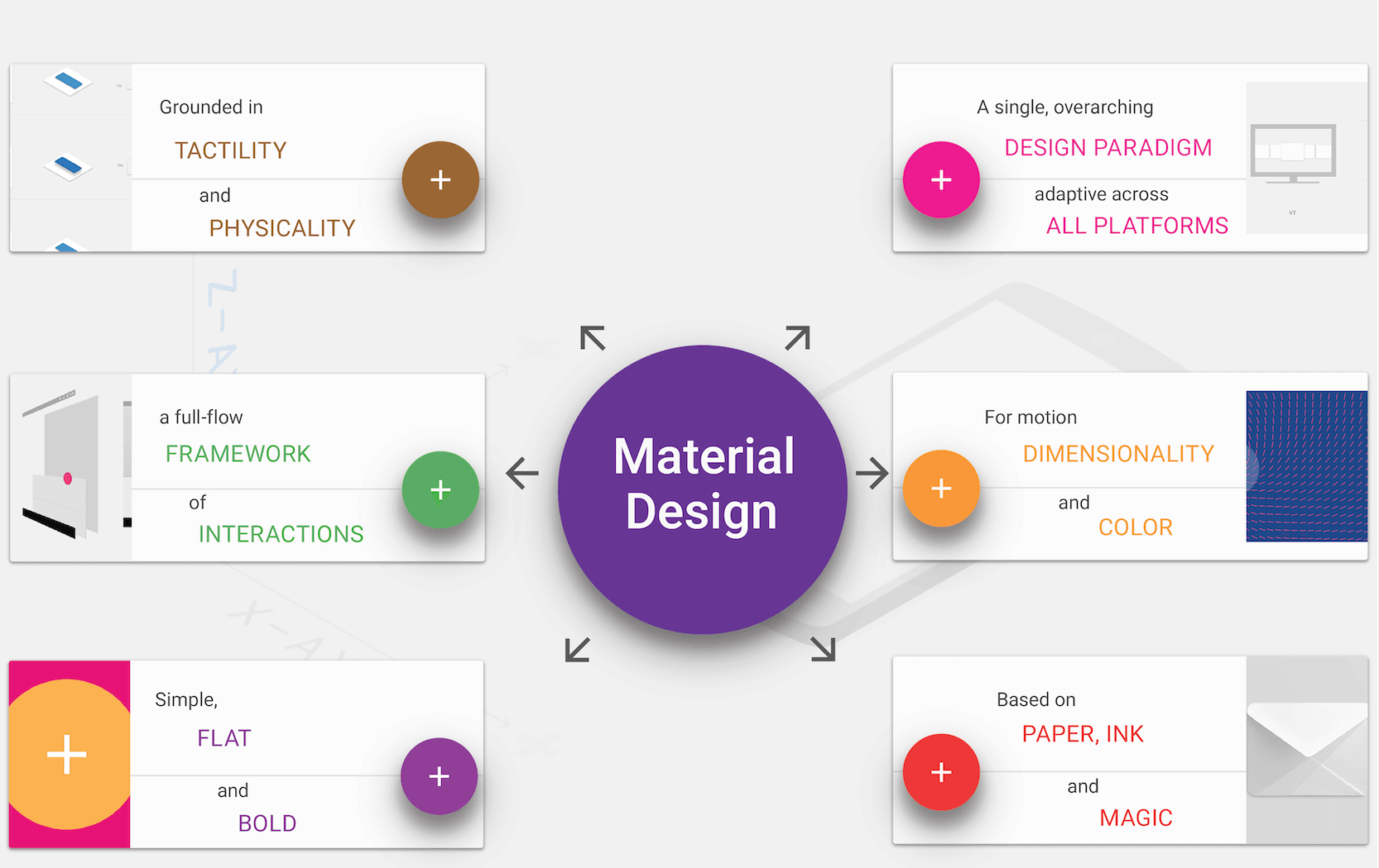 The Weather Channel iOS app is already using this approach. The app layers cards, colors and images. Where the design concepts overlap most is in the use of cards and the placement of geometric shapes. Where the design is “less Material” is in the lack of depth and shadowing so that the overall look is flatter and streamlined.
Gradients and monochromatic color layers are another way layered interfaces can continue to grow visually. Monochromatic color palettes are a classic design technique that make it easy to create sharp elements to fit almost any type of content.
The Elevate iOS app uses a gradient background with multiple levels of cards in its design. The animations and movements are very Material Design in nature but the use of a gradient is not. This simple evolution highlights how designers will start to break the visual rules of layered interfaces while continuing to leverage its more functional aspects.
Designers will continue to evolve layered interfaces and Material Design concepts with darker colors and hues. Most of the apps available right now feature light and white color schemes, but darker colors will start to emerge. Weather Timeline is a perfect example of this. The simple change to the color palette is enough to really make this app stand out from all the others available. It still uses a style that’s distinctly layered, but the darker interface is simple and elegant. The colors for the entire design are less saturated and toned to match the darker aesthetic.
Today’s layered interfaces are just the start. The simple visual style and high usability of this design style will continue to emerge and grow as designers — not just for Android — will latch on the concepts. What may be even more interesting is that the look of layered interfaces is really just an extension of a lot of the design techniques that have been growing in popularity for several years, including flat and minimalism.
At some point the pendulum may swing back to more “realistic-looking” interfaces, but until then this concept appears to have quite the foothold.
Mantra Labs deep dives into latest trends and innovations in the Web, Mobile, Enterprise and Internet of Things space. The insights generated from these studies helps us provide more value for our clients.
Guest written by P. Sudhakar, our ace Design Lead.
Knowledge thats worth delivered in your inbox
The insurance industry thrives on relationships—but it can only scale through efficiency, precision, and timely distribution. While much of the digital transformation buzz has focused on customer-facing portals, the real transformation is happening in the field, where modern sales apps are quietly driving a smarter, faster, and more empowered agent network.
Let’s explore how mobile-first sales enablement platforms are reshaping insurance sales across prospecting, onboarding, servicing, renewals, and growth.
Today’s insurance agent is not just a policy seller—they’re also a financial advisor, data gatherer, service representative, and the face of the brand. Yet many still rely on paper forms, disconnected tools, and manual processes.
That’s where intelligent sales apps come in—not just to digitize, but to optimize, personalize, and future-proof the entire agent journey.
Across the insurance value chain, sales agent apps have evolved into full-service platforms—streamlining operations, boosting conversions, and empowering agents in the field. These tools aren’t optional anymore, they’re critical to how modern insurers perform. Here’s how leading insurers are empowering their agents through technology:
Sales apps now empower agents to:
Agents spend significantly less time navigating through disjointed systems or chasing down information. With quick access to prioritized leads, appointment scheduling, and location tools—all in one app—they can focus more on meaningful customer interactions and closing sales, rather than administrative overhead.
Sales apps centralize post-sale activities such as:
Customers receive a consistent and seamless experience across touchpoints—whether online, in-person, or via mobile. With digital forms, real-time policy updates, and instant access to servicing tools, agents can handle post-sale tasks like renewals and claims faster, without paperwork delays—leading to improved satisfaction and higher retention.
Using smart tools, agents can:
Agents can conduct secure, interactive consultations from anywhere—sharing proposals, visual aids, and completing eKYC remotely. This not only expands their reach to customers in digital-first or geographically dispersed markets, but also builds greater trust through real-time engagement, clear communication, and a personalized advisory experience—all without needing a physical presence.
Modern insurance apps provide:
Field agents gain access to real-time performance insights, training modules, and incentive tracking—directly within the app. This empowers them to upskill on the go, stay motivated through transparent goal-setting, and make informed decisions that align with overall business KPIs. The result is a more agile, knowledgeable, and performance-driven sales force.
Advanced insurance apps support:
Even in low-connectivity or remote Tier 2 and 3 markets, agents can operate at full capacity—thanks to offline capabilities, secure authentication, and end-to-end sales execution tools. This ensures uninterrupted productivity, faster policy issuance, and adherence to compliance standards, regardless of location or network availability.
Some forward-thinking insurers are combining AI with health platforms to:
By integrating real-time health data from fitness trackers and wellness apps, insurers can offer hyper-personalized, preventive insurance products tailored to individual lifestyles. This empowers agents to move beyond transactional selling—becoming trusted advisors who recommend coverage based on customers’ health habits, life stages, and future needs, ultimately deepening engagement and improving long-term retention.
We help insurers go beyond surface-level digitization to build intelligent, mobile-first ecosystems that optimize agent efficiency and customer engagement—backed by real-world impact.
We partnered with a leading travel insurance provider to develop a high-performance agent workflow platform featuring:
This mobile-first solution empowered agents to close policies faster with significantly reduced paperwork and data entry time—improving agent productivity by 2x and enabling sales at scale.
For one of India’s leading health insurers, we helped implement a full-funnel engagement and analytics stack:
Whether you’re digitizing field sales, gamifying customer wellness, or fine-tuning your marketing engine, Mantra Labs brings the technology depth, insurance expertise, and user-first design to turn strategy into scalable execution.
If you’re ready to modernize your agent network – Get in touch with us to explore how we can build intelligent, mobile-first tools tailored to your distribution strategy. Just remember, the best sales apps aren’t just tools, they’re growth engines; and field sales success isn’t about more apps. It’s about the right workflows, in the right hands, at the right time.
Knowledge thats worth delivered in your inbox


Our Sales Team will be in touch with you shortly.

Hello Stranger! Please fill in a few details,and you’ll receive a link to this case study.
 We have mailed you this case study.
Thanks for subscribing.
