


Published on Apr 12, 2016
Updated on Oct 16, 2019
Create superior customer experiences to enhance competitive advantage.
Go from zero to breakthrough with scalable, future-proof solutions.
Harness deep tech for smarter solutions and maximum impact.
Accelerate value delivery with powerful pre-built digital tools.
Help businesses connect with an internet first generation.
Test the smarter way: where precision meets efficiency.
Unlock real-time and personalized customer journeys for mobile first generation.
Turn data into decisive action with scalable AI infrastructure.
Design agile digital foundations that scale with tomorrow's business needs.
Build new-age architecture for maximum efficiency and hyper-growth.
Fine-tune your cloud infrastructure for peak performance.
Automated compliance and control for global regulations.

All
Customer Experience
Mantra
Application Development
Insurtech
Digital Health
Insurance
Deep-Tech
AgriTech(1)
Augmented Reality(21)
Clean Tech(9)
Customer Journey(17)
Design(45)
Solar Industry(8)
User Experience(68)
Edtech(10)
Events(34)
HR Tech(3)
Interviews(10)
Life@mantra(11)
Logistics(6)
Manufacturing(5)
Strategy(18)
Testing(9)
Android(48)
Backend(32)
Dev Ops(11)
Enterprise Solution(33)
Technology Modernization(9)
Frontend(29)
iOS(43)
Javascript(15)
AI in Insurance(41)
Insurtech(67)
Product Innovation(59)
Solutions(22)
E-health(12)
HealthTech(25)
mHealth(5)
Telehealth Care(4)
Telemedicine(5)
Artificial Intelligence(154)
Bitcoin(8)
Blockchain(19)
Cognitive Computing(8)
Computer Vision(8)
Data Science(24)
FinTech(51)
Banking(7)
Intelligent Automation(27)
Machine Learning(48)
Natural Language Processing(14)
Material Design is a Latest design language developed by Google. Material Design makes more liberal use of grid-based layouts, responsive animations and transitions, padding, and depth effects such as lighting and shadow.
Material Design is a Google’s conceptual design philosophy that outlines how apps should look and work on mobile devices. It breaks down everything — such as animation, style, layout- and gives guidance on patterns, components and usability. According to Google: “We challenged ourselves to create a visual language for our users that synthesizes the classic principles of good design with the innovation and possibility of technology and science. This is material design.”
Material starts with mobile but extends to any other device. It is rooted in a few principles:
Realistic visual cues: The design is grounded in reality and actually inspired by design with paper and ink.
Bold, graphic and intentional: Fundamental design techniques drive the visuals. Typography, grids, space, scale, color and imagery guide the entire design. Elements live in defined spaces with a clear hierarchy. Color and type choices are bold and deliberate.
Motion provides meaning: Animation is a key component of Material Design, but it can’t just be there for the sake of movement. Animations need to happen in a single environment, serve to focus the design and include simple and easy transitions. Movements and actions should mirror the physical world.
Few points we need to understand about Material Design:
Understanding the “Tactile Surface”
One of the things that comes up a lot when talking about layered interfaces is the “tactile surface.”
Think of this as having multiple sheets of paper that are stacked together to create a framework for how everything within the design works. These sheets are a little different from physical sheets of paper in that they can change shape and form — such as stretch or bend — but work in a way that is seemingly realistic.
As explained in Mobile Design Trends for 2015, treat the tactile surface is a container for content and information. The container is flat in design but has a faint shadow to separate it from other containers and layers. Other techniques to create separation between layers – such as textures, gradients or strokes – are unnecessary.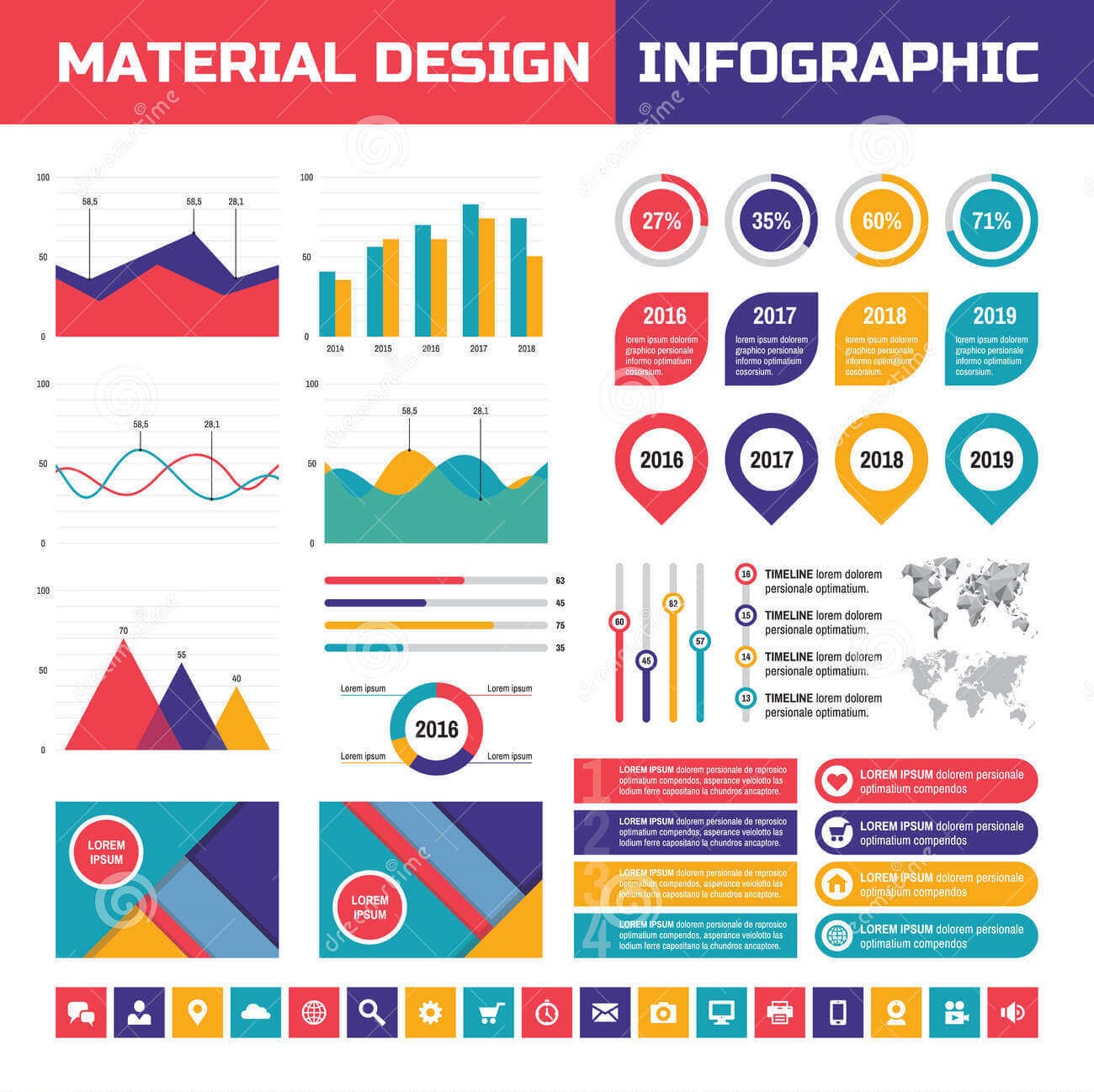 You can see the separation in the layers for the Reddit app, above. There is an obvious top menu layer covering a greyed out main content layer. Even the main header image contains elements of layering and shading that emphasize a three-dimensional tactile surface.
As demonstrated in the Android Lollipop UI Kit, a tactile surface clearly established the relationship and function of content within a design. (Each container often has one job, such as a link or video player.) This approach also establishes depth, as elements in other containers are layered, creating a seemingly three-dimensional world.
Material is Made for Adaptive Design:
Layered interfaces are inherently made for adaptive design. All of the design guidelines actually encourage a designer to work with an adaptive layout (whether you prefer Adaptive or responsive is up for debate, however.)
When thinking about layered interfaces, it is important to consider how all the elements relate to one another.
Google recommends its standards because of a “flexible grid that ensures consistency across layouts, breakpoint details about how content reflows on different screens, and a description of how an app can scale from small to extra-large screens.”
Considerations include:
Breakpoints: Widths include 480, 600, 840, 960, 1280, 1440 and 1600 pixels.
Grid: 12-column layout with margins and gutters (8, 16, 24, or 40 pixels) and a baseline grid.
Surface behaviors: UI adapts to the type of screen so that surfaces are visible or toggled to hide.
Patterns: Function is based on screen size, including reveal, transform, expand, reflow and divide.
These considerations make it easy for designers to ensure their interfaces adapt for any device in any situation. They provide a baseline to help designers as they construct layouts for desktop, tablet and smartphone.
Material and Other Mobile Design Trends:
When it comes to creating layered interfaces, other trends also come into play.
Material Design looks nice and it works well in a variety of places. Designers will want to take advantage of that and the lite version provides the perfect level of guidance. Material Design Lite is also a good tool for designers and developers that want to create a unified web-app experience, so that apps look, feel and function in the same way regardless of device. Layers are definitely going to stick around, but the overall look may be a little more “layered” and a little less material, so that the design falls somewhere between Material Lite and iOS standards.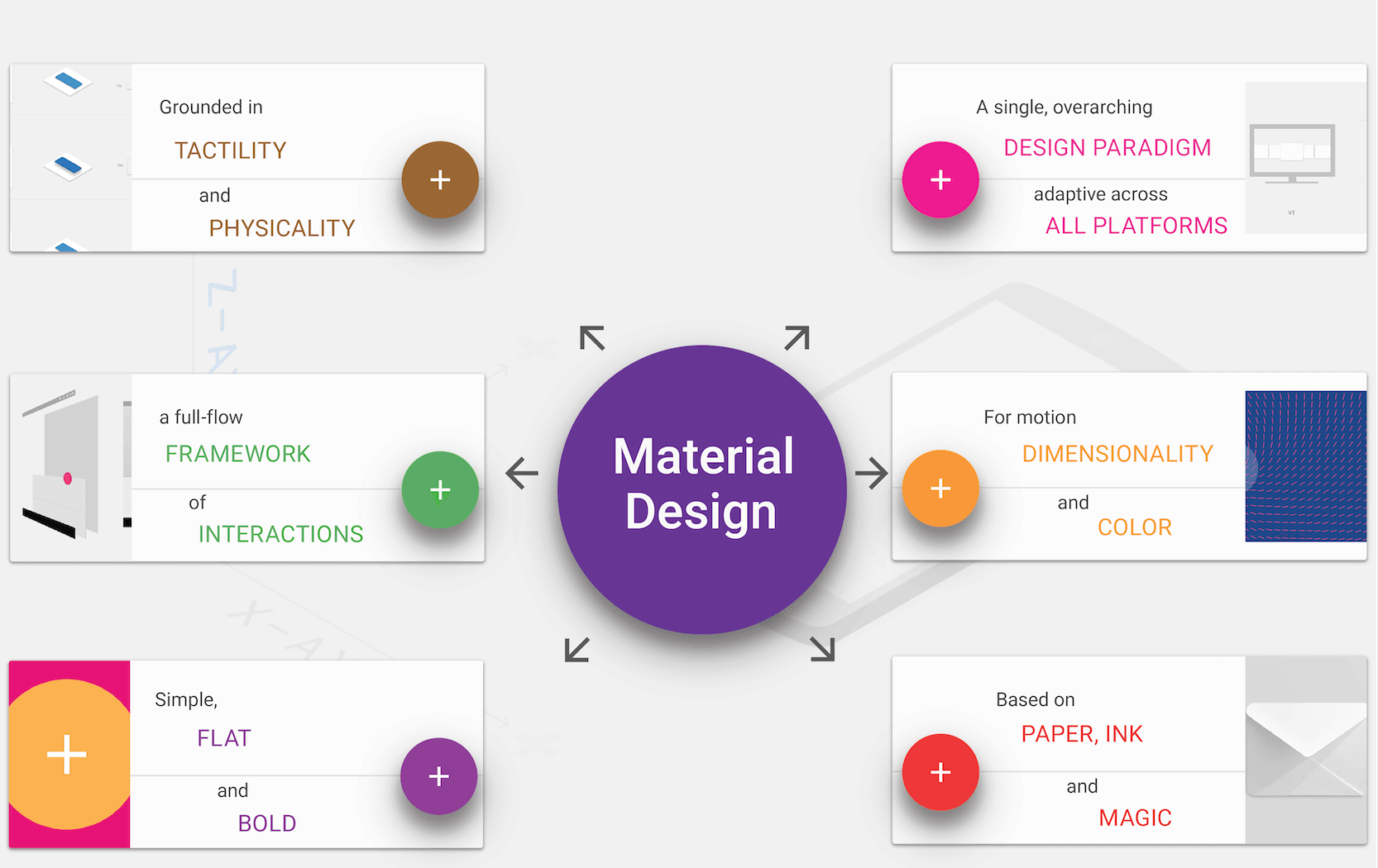 The Weather Channel iOS app is already using this approach. The app layers cards, colors and images. Where the design concepts overlap most is in the use of cards and the placement of geometric shapes. Where the design is “less Material” is in the lack of depth and shadowing so that the overall look is flatter and streamlined.
Gradients and monochromatic color layers are another way layered interfaces can continue to grow visually. Monochromatic color palettes are a classic design technique that make it easy to create sharp elements to fit almost any type of content.
The Elevate iOS app uses a gradient background with multiple levels of cards in its design. The animations and movements are very Material Design in nature but the use of a gradient is not. This simple evolution highlights how designers will start to break the visual rules of layered interfaces while continuing to leverage its more functional aspects.
Designers will continue to evolve layered interfaces and Material Design concepts with darker colors and hues. Most of the apps available right now feature light and white color schemes, but darker colors will start to emerge. Weather Timeline is a perfect example of this. The simple change to the color palette is enough to really make this app stand out from all the others available. It still uses a style that’s distinctly layered, but the darker interface is simple and elegant. The colors for the entire design are less saturated and toned to match the darker aesthetic.
Today’s layered interfaces are just the start. The simple visual style and high usability of this design style will continue to emerge and grow as designers — not just for Android — will latch on the concepts. What may be even more interesting is that the look of layered interfaces is really just an extension of a lot of the design techniques that have been growing in popularity for several years, including flat and minimalism.
At some point the pendulum may swing back to more “realistic-looking” interfaces, but until then this concept appears to have quite the foothold.
Mantra Labs deep dives into latest trends and innovations in the Web, Mobile, Enterprise and Internet of Things space. The insights generated from these studies helps us provide more value for our clients.
Guest written by P. Sudhakar, our ace Design Lead.
Knowledge thats worth delivered in your inbox
Smart Manufacturing starts with real-time visibility.
Manufacturing companies today generate data by the second through sensors, machines, ERP systems, and MES platforms. But without real-time insights, even the most advanced production lines are essentially flying blind.
Manufacturers are implementing real-time dashboards that serve as control towers for their daily operations, enabling them to shift from reactive to proactive decision-making. These tools are essential to the evolution of Smart Manufacturing, where connected systems, automation, and intelligent analytics come together to drive measurable impact.
Data is available, but what’s missing is timely action.
For many plant leaders and COOs, one challenge persists: operational data is dispersed throughout systems, delayed, or hidden in spreadsheets. And this delay turns into a liability.
Real-time dashboards help uncover critical answers:
By converting raw inputs into real-time manufacturing analytics, dashboards make operational intelligence accessible to operators, supervisors, and leadership alike, enabling teams to anticipate problems rather than react to them.
Line performance and downtime trends
Track OEE in real time and identify underperforming lines.
Predictive maintenance alerts
Utilize historical and sensor data to identify potential part failures in advance.
Inventory heat maps & reorder thresholds
Anticipate stockouts or overstocks based on dynamic reorder points.
Quality metrics linked to operator actions
Isolate shifts or procedures correlated with spikes in defects or rework.
These insights allow production teams to drive day-to-day operations in line with Smart Manufacturing principles.
Role-based dashboards
Dashboards can be configured for machine operators, shift supervisors, and plant managers, each with a tailored view of KPIs.
Embedded alerts and nudges
Real-time prompts, like “Line 4 below efficiency threshold for 15+ minutes,” reduce response times and minimize disruptions.
Cross-functional drill-downs
Teams can identify root causes more quickly because users can move from plant-wide overviews to detailed machine-level data in seconds.
Data lakehouse integration
Unified access to ERP, MES, IoT sensor, and QA systems—ensuring reliable and timely manufacturing analytics.
ETL pipelines
Real-time data ingestion from high-frequency sources with minimal latency.
Visualization tools
Custom builds using Power BI, or customized solutions designed for frontline usability and operational impact.
Mantra Labs partnered with a North American die-casting manufacturer to unify its operational data into a real-time dashboard. Fragmented data, manual reporting, delayed pricing decisions, and inconsistent data quality hindered operational efficiency and strategic decision-making.
As this case shows, real-time dashboards are not just operational tools—they’re strategic enablers.
(Learn More: Powering the Future of Metal Manufacturing with Data Engineering)
| Aspect | What You Should Know |
| 1. Why Static Reports Fall Short | Delayed insights after issues occur Disconnected systems (ERP, MES, sensors) No real-time alerts or embedded decision logic |
| 2. What Real-Time Dashboards Enable | Track OEE and downtime in real-time Predictive maintenance using sensor data Dynamic inventory heat maps Quality linked to operators |
| 3. Dashboards That Drive Action | Role-based views (operator to CEO) Embedded alerts like “Line 4 down for 15+ mins” Drilldowns from plant-level to machine-level |
| 4. What Powers These Dashboards | Unified Data Lakehouse (ERP + IoT + MES) Real-time ETL pipelines Power BI or custom dashboards built for frontline usability |
Smart Manufacturing dashboards aren’t just analytics tools—they’re productivity engines. Dashboards that deliver real-time insight empower frontline teams to make faster, better decisions—whether it’s adjusting production schedules, triggering preventive maintenance, or responding to inventory fluctuations.
Explore how Mantra Labs can help you unlock operations intelligence that’s actually usable.
Knowledge thats worth delivered in your inbox


Our Sales Team will be in touch with you shortly.

Hello Stranger! Please fill in a few details,and you’ll receive a link to this case study.
 We have mailed you this case study.
Thanks for subscribing.
