


Published on Aug 11, 2023
More than 90% of information on the web is presented in the form of text. “Text” is a medium of communication in the context of web design that attracts the users, holds their attention, conveys a certain emotion, and helps users understand the kind of information provided. Here’s where typography comes into play. It is used to justify the power of the textual content, trigger curiosity, compel the users to continue reading, and ensure a great user experience (UX).
However, typography involves a lot more than choosing an aesthetic font for your web or mobile UI. The color and contrasts, font scales, white space, alignment, text hierarchy, consistency, and other elements in your typography can enhance usability, clarity, readability, and accessibility within a UI design. A designer’s ability to choose the right typography makes all the difference between a good, bad, and excellent design.
In this blog post, we will explore everything you need to know about typography, its importance in UI design, and how to choose the correct typeface for your web project.
What is Typography?
Most of us are aware of the terminology, but let’s start with the basics.
Typography is the art of arranging textual elements such as typefaces (a set of design features for letters and other characters like spacing, relative size, etc.) in the right combination that aims to convey certain messages to viewers and bring out desired emotions.
Why is Typography so important in UI Design?
When users visit a website or mobile app, they often scan through the pages instead of reading the content line by line to see if it has the information they are looking for. A well-organized and scanable typography can, therefore, serve as a visual communication tool to convey interface text in a clear hierarchy and help impress, engage, and convince users and potential customers, as a result. Let’s see why a good typography is critical for visual design.
1. Communicate clearly
Good typography makes the journey easier for the users, whether they are reading intently or scanning through the content casually. It helps users to skim through the available information and thoroughly read the sections they are more interested in, thereby improving navigability. It also helps the users to get a good hold of the information faster without having to pay more attention.
2. Attract user attention
Today users are spoilt for choice when it comes to the vast number of websites and content on the internet. But it is more likely that they will get more attracted to sources that offer a better visually pleasing experience. The right typography can enable you to set the exact mood of the content for the users by offering a sense of familiarity, desirability, and emotional connection as well as capture attention through the size, weight, color, and spacing of the text.
3. Build Brand Recognition
Brands choose specific fonts and use them across all their communication collaterals to build recognition, a sense of harmony, and consistency throughout the visual design. It helps in offering the users the same brand experience through all channels, be it on-screen or off-screen.

For example, Coca-Cola’s font is instantly recognizable with its Spencerian Script font which gives a consistent experience for users and prospects.
4. Influence Decisions
Typography also plays a crucial role in compelling users to take a desired action (register, sign up for a newsletter, download, share, or buy a product, etc.) on websites and mobile apps. For instance, a limited-time offer or deal when highlighted can convey urgency and persuade the user to take action.
How to Choose the Right Typography for Your UI Project?
When you have a clear understanding of the different essential elements and principles of typography, you can learn how to use it effectively in context through practice. Making the right choice depends on many factors besides the aesthetics, such as:
- The brand or product personality: Consider what defines the core characteristics of the brand and select typefaces that reflect them.
- The tone of the brand message: Make sure to choose the typography that is appropriate for the information conveyed by the brand.
- Functionality: Make sure that the font is legible, readable, and accessible. This is more important than looking stylistically beautiful.
- Performance: Choose typefaces that are web browser-friendly such as Google fonts. Avoid excess weight!
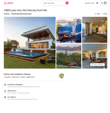
- Inspiration: Take some cues from successful examples when you are not sure where to start. Let’s take the example of Airbnb and see some of the elements that make its typography so good and apt.
- Visual hierarchy and contrast: When users start their journey on your website or app, they are in the discovery stage where they browse through the website content. In this stage, not every information you provide on your UI seems to be important to them. So, the right visual hierarchy can help these users move on to the next stage of the journey.
In the example of Airbnb, we can see that the brand has used only 3 font sizes predominantly. This makes the text clean and consistent. Also, all the important pieces of text that can potentially influence decision-making, are in Semibold and the less important content or the descriptive body is in Regular font. Note that the price at the bottom is given extra visual weight.
- Leading and Spacing: The characters do not bump into each other and the ample leading space used in the body text makes it very easy to read. The page header, in contrast, has a reduced leading and keeps the text visually together. Use smaller leading for larger font sizes and higher for small font sizes.
- Legibility: The entire Airbnb page uses the #222222 hex code for black except for the really low-priority text. This makes the text extremely legible.
Conclusion
Visual designers often overlook typography while focusing on graphic design, icons, illustrations, color palettes, and other elements. Good typography can do a lot for your user interface and this is why UI designers treat typography as design and use it for visual impact.
There are a lot many factors to consider when choosing the right typography other than what we have covered in this post. But, focusing on the ones mentioned above can also help improve your design game in one way or another.
Don’t forget to test, test, and test to get useful feedback from real users and take notes from some of your favorite websites and apps to get a clearer insight into what is working, and what you can do further.
About the author
Shantanu Laha is a Senior UI/UX designer at Mantra Labs. He loves photography and traveling. In his free time, he enjoys cooking and trying out new dishes.
Knowledge thats worth delivered in your inbox


