Try : Insurtech, Application Development

AgriTech(1)

Augmented Reality(21)

Clean Tech(9)

Customer Journey(17)

Design(45)

Solar Industry(8)

User Experience(68)

Edtech(10)

Events(34)

HR Tech(3)

Interviews(10)

Life@mantra(11)

Logistics(6)

Manufacturing(5)

Strategy(18)

Testing(9)

Android(48)

Backend(32)

Dev Ops(11)

Enterprise Solution(33)

Technology Modernization(9)

Frontend(29)

iOS(43)

Javascript(15)

AI in Insurance(41)

Insurtech(67)

Product Innovation(59)

Solutions(22)

E-health(12)

HealthTech(25)

mHealth(5)

Telehealth Care(4)

Telemedicine(5)

Artificial Intelligence(154)

Bitcoin(8)

Blockchain(19)

Cognitive Computing(8)

Computer Vision(8)

Data Science(24)

FinTech(51)

Banking(7)

Intelligent Automation(27)

Machine Learning(48)

Natural Language Processing(14)

expand Menu Filters

Dark Mode Design: Tips and Best Practices

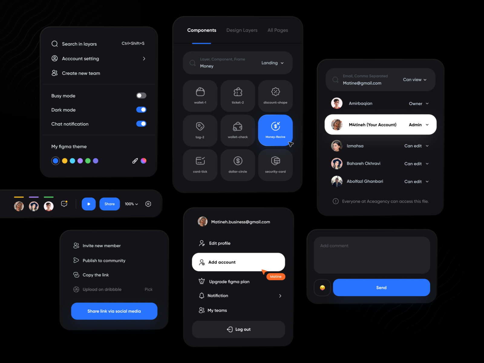
Dark mode has rapidly gained popularity in recent years, becoming a staple feature in many applications and operating systems. This alternative theme not only offers aesthetic appeal but also provides functional benefits such as reduced eye strain in low-light environments and extended battery life on OLED screens. However, designing an effective dark mode is more than just inverting colors. It requires careful consideration to ensure readability, visual comfort, and overall user experience. Here are some tips and best practices for creating a successful dark mode design.

1. Choose Appropriate Background Colors

  • Avoid Pure Black: Instead of using pure black (#000000), opt for very dark shades of gray (#121212 or #1C1C1C). Pure black can create too much contrast and strain the eyes, whereas dark gray reduces glare and creates a more comfortable viewing experience.

Example: Slack uses a dark gray background in its dark mode to provide a soft contrast with the text, reducing eye strain during prolonged use.

2. Use High Contrast for Text

  • Ensure Readability: Text should stand out against the background without being harsh. Use high-contrast colors, typically white (#FFFFFF) or light gray (#E0E0E0), to maintain readability while avoiding excessive brightness.

Example: Twitter’s dark mode features white text on a dark gray background, ensuring that content is easy to read without being overwhelming.

3. Accentuate with Accent Colors

  • Highlight Important Elements: Accent colors can help guide users’ attention to important elements like buttons, links, and notifications. Use colors that stand out against the dark background without clashing.

Example: Spotify uses its signature green as an accent color in dark mode, making buttons and selected items easily noticeable against the dark interface.

4. Mind the Use of Images and Icons

  • Adjust Brightness and Contrast: Images and icons should be adapted to fit the dark theme. Ensure that images do not appear too bright or out of place. Icons may need to be recolored or adjusted for visibility.

Example: Instagram automatically adjusts the brightness and contrast of images in dark mode, ensuring that visuals remain clear and cohesive with the overall theme.

5. Test in Different Lighting Conditions

  • Real-World Scenarios: Users will interact with dark mode in various lighting environments. Test your design in both bright and dim settings to ensure it performs well in all conditions.

Example: Apple’s dark mode on iOS is designed to adapt to different ambient light conditions, providing a consistent user experience whether in a dark room or outdoors.

6. Consider Emotional Impact

  • Mood and Tone: Dark mode can convey different emotions and tones, such as elegance, sophistication, or even somberness. Choose your colors and design elements to match the desired emotional impact.

Example: Netflix’s dark mode enhances the viewing experience by creating a cinematic feel, drawing users into the content and reducing distractions.

7. Optimize for OLED Screens

  • Battery Efficiency: On OLED screens, black pixels are turned off, saving battery life. Design your dark mode to take advantage of this feature, particularly on mobile devices.

Example: Google’s dark mode for apps like YouTube takes full advantage of OLED screens, helping to conserve battery life during video playback.

8. Provide User Control

  • Customization Options: Allow users to switch between light and dark modes easily. Providing options for automatic switching based on time of day or ambient light conditions can enhance usability.

Example: Android’s system-wide dark mode can be set to switch automatically based on the time of day, offering users a seamless experience without manual adjustments.

Conclusion

Designing an effective dark mode requires more than just a color inversion. It demands thoughtful adjustments to ensure readability, comfort, and consistency across different elements and environments. By following these best practices, designers can create dark mode interfaces that are not only visually appealing but also enhance the overall user experience. Whether you’re updating an existing application or designing a new one, keep these tips in mind to make your dark mode a feature that users will love.

Implementing dark mode thoughtfully can significantly enhance user satisfaction, making your app or website more versatile and user-friendly. Happy designing!

Cancel

Knowledge thats worth delivered in your inbox

Smart Manufacturing Dashboards: A Real-Time Guide for Data-Driven Ops

Smart Manufacturing starts with real-time visibility.

Manufacturing companies today generate data by the second through sensors, machines, ERP systems, and MES platforms. But without real-time insights, even the most advanced production lines are essentially flying blind.

Manufacturers are implementing real-time dashboards that serve as control towers for their daily operations, enabling them to shift from reactive to proactive decision-making. These tools are essential to the evolution of Smart Manufacturing, where connected systems, automation, and intelligent analytics come together to drive measurable impact.

Data is available, but what’s missing is timely action.

For many plant leaders and COOs, one challenge persists: operational data is dispersed throughout systems, delayed, or hidden in spreadsheets. And this delay turns into a liability.

Real-time dashboards help uncover critical answers:

  • What caused downtime during last night’s shift?
  • Was there a delay in maintenance response?
  • Did a specific inventory threshold trigger a quality issue?

By converting raw inputs into real-time manufacturing analytics, dashboards make operational intelligence accessible to operators, supervisors, and leadership alike, enabling teams to anticipate problems rather than react to them.

1. Why Static Reports Fall Short

  • Reports often arrive late—after downtime, delays, or defects have occurred.
  • Disconnected data across ERP, MES, and sensors limits cross-functional insights.
  • Static formats lack embedded logic for proactive decision support.

2. What Real-Time Dashboards Enable

Line performance and downtime trends
Track OEE in real time and identify underperforming lines.

Predictive maintenance alerts
Utilize historical and sensor data to identify potential part failures in advance.

Inventory heat maps & reorder thresholds
Anticipate stockouts or overstocks based on dynamic reorder points.

Quality metrics linked to operator actions
Isolate shifts or procedures correlated with spikes in defects or rework.

These insights allow production teams to drive day-to-day operations in line with Smart Manufacturing principles.

3. Dashboards That Drive Action

Role-based dashboards
Dashboards can be configured for machine operators, shift supervisors, and plant managers, each with a tailored view of KPIs.

Embedded alerts and nudges
Real-time prompts, like “Line 4 below efficiency threshold for 15+ minutes,” reduce response times and minimize disruptions.

Cross-functional drill-downs
Teams can identify root causes more quickly because users can move from plant-wide overviews to detailed machine-level data in seconds.

4. What Powers These Dashboards

Data lakehouse integration
Unified access to ERP, MES, IoT sensor, and QA systems—ensuring reliable and timely manufacturing analytics.

ETL pipelines
Real-time data ingestion from high-frequency sources with minimal latency.

Visualization tools
Custom builds using Power BI, or customized solutions designed for frontline usability and operational impact.

Smart Manufacturing in Action: Reducing Market Response Time from 48 Hours to 30 Minutes

Mantra Labs partnered with a North American die-casting manufacturer to unify its operational data into a real-time dashboard. Fragmented data, manual reporting, delayed pricing decisions, and inconsistent data quality hindered operational efficiency and strategic decision-making.

Tech Enablement:

  • Centralized Data Hub with real-time access to critical business insights.
  • Automated report generation with data ingestion and processing.
  • Accurate price modeling with real-time visibility into metal price trends, cost impacts, and customer-specific pricing scenarios. 
  • Proactive market analysis with intuitive Power BI dashboards and reports.

Business Outcomes:

  • Faster response to machine alerts
  • Quality incidents traced to specific operator workflows
  • 4X faster access to insights led to improved inventory optimization.

As this case shows, real-time dashboards are not just operational tools—they’re strategic enablers. 

(Learn More: Powering the Future of Metal Manufacturing with Data Engineering)

Key Takeaways: Smart Manufacturing Dashboards at a Glance

AspectWhat You Should Know
1. Why Static Reports Fall ShortDelayed insights after issues occur
Disconnected systems (ERP, MES, sensors)
No real-time alerts or embedded decision logic
2. What Real-Time Dashboards EnableTrack OEE and downtime in real-time
Predictive maintenance using sensor data
Dynamic inventory heat maps
Quality linked to operators
3. Dashboards That Drive ActionRole-based views (operator to CEO)
Embedded alerts like “Line 4 down for 15+ mins”
Drilldowns from plant-level to machine-level
4. What Powers These DashboardsUnified Data Lakehouse (ERP + IoT + MES)
Real-time ETL pipelines
Power BI or custom dashboards built for frontline usability

Conclusion

Smart Manufacturing dashboards aren’t just analytics tools—they’re productivity engines. Dashboards that deliver real-time insight empower frontline teams to make faster, better decisions—whether it’s adjusting production schedules, triggering preventive maintenance, or responding to inventory fluctuations.

Explore how Mantra Labs can help you unlock operations intelligence that’s actually usable.

Cancel

Knowledge thats worth delivered in your inbox

Loading More Posts ...
Go Top
ml floating chatbot