Try : Insurtech, Application Development

AgriTech(1)

Augmented Reality(21)

Clean Tech(9)

Customer Journey(17)

Design(45)

Solar Industry(8)

User Experience(68)

Edtech(10)

Events(34)

HR Tech(3)

Interviews(10)

Life@mantra(11)

Logistics(6)

Manufacturing(4)

Strategy(18)

Testing(9)

Android(48)

Backend(32)

Dev Ops(11)

Enterprise Solution(33)

Technology Modernization(9)

Frontend(29)

iOS(43)

Javascript(15)

AI in Insurance(41)

Insurtech(67)

Product Innovation(59)

Solutions(22)

E-health(12)

HealthTech(25)

mHealth(5)

Telehealth Care(4)

Telemedicine(5)

Artificial Intelligence(154)

Bitcoin(8)

Blockchain(19)

Cognitive Computing(8)

Computer Vision(8)

Data Science(23)

FinTech(51)

Banking(7)

Intelligent Automation(27)

Machine Learning(48)

Natural Language Processing(14)

expand Menu Filters

Dark Mode Design: Tips and Best Practices

Dark mode has rapidly gained popularity in recent years, becoming a staple feature in many applications and operating systems. This alternative theme not only offers aesthetic appeal but also provides functional benefits such as reduced eye strain in low-light environments and extended battery life on OLED screens. However, designing an effective dark mode is more than just inverting colors. It requires careful consideration to ensure readability, visual comfort, and overall user experience. Here are some tips and best practices for creating a successful dark mode design.

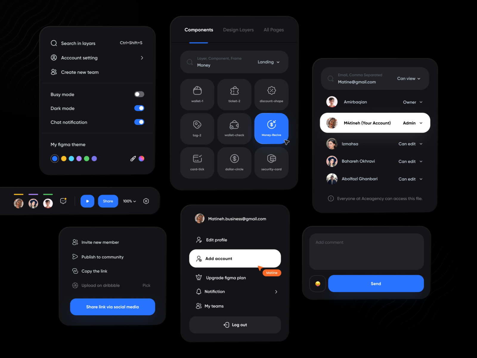
1. Choose Appropriate Background Colors

  • Avoid Pure Black: Instead of using pure black (#000000), opt for very dark shades of gray (#121212 or #1C1C1C). Pure black can create too much contrast and strain the eyes, whereas dark gray reduces glare and creates a more comfortable viewing experience.

Example: Slack uses a dark gray background in its dark mode to provide a soft contrast with the text, reducing eye strain during prolonged use.

2. Use High Contrast for Text

  • Ensure Readability: Text should stand out against the background without being harsh. Use high-contrast colors, typically white (#FFFFFF) or light gray (#E0E0E0), to maintain readability while avoiding excessive brightness.

Example: Twitter’s dark mode features white text on a dark gray background, ensuring that content is easy to read without being overwhelming.

3. Accentuate with Accent Colors

  • Highlight Important Elements: Accent colors can help guide users’ attention to important elements like buttons, links, and notifications. Use colors that stand out against the dark background without clashing.

Example: Spotify uses its signature green as an accent color in dark mode, making buttons and selected items easily noticeable against the dark interface.

4. Mind the Use of Images and Icons

  • Adjust Brightness and Contrast: Images and icons should be adapted to fit the dark theme. Ensure that images do not appear too bright or out of place. Icons may need to be recolored or adjusted for visibility.

Example: Instagram automatically adjusts the brightness and contrast of images in dark mode, ensuring that visuals remain clear and cohesive with the overall theme.

5. Test in Different Lighting Conditions

  • Real-World Scenarios: Users will interact with dark mode in various lighting environments. Test your design in both bright and dim settings to ensure it performs well in all conditions.

Example: Apple’s dark mode on iOS is designed to adapt to different ambient light conditions, providing a consistent user experience whether in a dark room or outdoors.

6. Consider Emotional Impact

  • Mood and Tone: Dark mode can convey different emotions and tones, such as elegance, sophistication, or even somberness. Choose your colors and design elements to match the desired emotional impact.

Example: Netflix’s dark mode enhances the viewing experience by creating a cinematic feel, drawing users into the content and reducing distractions.

7. Optimize for OLED Screens

  • Battery Efficiency: On OLED screens, black pixels are turned off, saving battery life. Design your dark mode to take advantage of this feature, particularly on mobile devices.

Example: Google’s dark mode for apps like YouTube takes full advantage of OLED screens, helping to conserve battery life during video playback.

8. Provide User Control

  • Customization Options: Allow users to switch between light and dark modes easily. Providing options for automatic switching based on time of day or ambient light conditions can enhance usability.

Example: Android’s system-wide dark mode can be set to switch automatically based on the time of day, offering users a seamless experience without manual adjustments.

Conclusion

Designing an effective dark mode requires more than just a color inversion. It demands thoughtful adjustments to ensure readability, comfort, and consistency across different elements and environments. By following these best practices, designers can create dark mode interfaces that are not only visually appealing but also enhance the overall user experience. Whether you’re updating an existing application or designing a new one, keep these tips in mind to make your dark mode a feature that users will love.

Implementing dark mode thoughtfully can significantly enhance user satisfaction, making your app or website more versatile and user-friendly. Happy designing!

Cancel

Knowledge thats worth delivered in your inbox

NPS in Insurance Claims: What Insurance Leaders Are Doing Differently

Claims are the moment of truth. Are you turning them into moments of loyalty?

In insurance, your app interface might win you downloads. Your pricing might drive conversions.
But it’s the claims experience that decides whether a customer stays—or leaves for good.

According to a survey by NPS Prism, promoters are 2.3 times more likely to renew their insurance policies than passives or detractors—highlighting the strong link between customer advocacy and retention.

NPS in insurance industry is a strong predictor of customer retention. Many insurers are now prioritizing NPS to improve their claims experience.

So, what are today’s high-NPS insurers doing differently? Spoiler: it’s not just about faster payouts.

We’ve worked with claims teams that had best-in-class automation—but still had low NPS. Why? Because the process felt like a black box.
Customers didn’t know where their claim stood. They weren’t sure what to do next. And when money was at stake, silence created anxiety and dissatisfaction.

Great customer experience (CX) in claims isn’t just about speed—it’s about giving customers a sense of control through clear communication and clarity.

The Traditional Claims Journey

  • Forms → Uploads → Phone calls → Waiting
  • No real-time updates
  • No guidance after claim initiation
  • Paper documents and email ping-pong

The result? Frustrated customers and overwhelmed call centers.

The CX Gap: It’s Not Just Speed—It’s Transparency

Customers don’t always expect instant decisions. What they want:

  • To know what’s happening with their claim
  • To understand what’s expected of them
  • To feel heard and supported during the process

How NPS Leaders Are Winning Loyalty with CX-Driven Claims and High NPS

Image Source: NPS Prism

1. Real-Time Status Updates

Transparency to the customer via mobile app, email, or WhatsApp—keeping them in the loop with clear milestones. 

2. Proactive Nudges

Auto-reminders, such as “upload your medical bill” or “submit police report,” help close matters much faster and avoid back-and-forth.

3. AI-Powered Document Uploads

Single-click scans with OCR + AI pull data instantly—no typing, no errors.

4. In-the-Moment Feedback Loops

Simple post-resolution surveys collect sentiment and alert on issues in real time.

For e.g., Lemonade uses emotional AI to detect customer sentiment during the claims process, enabling empathetic responses that boost satisfaction and trust.

Smart Nudges from Real-Time Journey Tracking

For a leading insurance firm, we mapped the entire in-app user journey—from buying or renewing a policy to initiating a claim or checking discounts. This helped identify exactly where users dropped off. Based on real-time activity, we triggered personalized notifications and offers—driving better engagement and claim completion rates.

Tech Enablement

  • Claims Orchestration Layer: Incorporates legacy systems, third-party tools, and front-end apps for a unified experience.
  • AI & ML Models: For document validation, fraud detection, and claim routing, sentiment analysis is used. Businesses utilizing emotional AI report a 25% increase in customer satisfaction and a 30% decrease in complaints, resulting in more personalized and empathetic interactions.
  • Self-Service Portals: Customers can check their status, update documents, and track payouts—all without making a phone call.

Business Impact

What do insurers gain from investing in CX?

A faster claim is good. But a fair, clear, and human one wins loyalty.

And companies that consistently track and act on CX metrics are better positioned to retain customers and build long-term loyalty.

At Mantra Labs, we help insurers build end-to-end, tech-enabled claims journeys that delight customers and drive operational efficiency.
From intelligent document processing to AI-led nudges, we design for empathy at scale.

Want a faster and more transparent claims experience?

Let’s design it together.
Talk to our insurance transformation team today.

Cancel

Knowledge thats worth delivered in your inbox

Loading More Posts ...
Go Top
ml floating chatbot