


7 minutes, 7 seconds read
Published on Mar 16, 2016
Updated on Apr 2, 2024
Create superior customer experiences to enhance competitive advantage.
Go from zero to breakthrough with scalable, future-proof solutions.
Harness deep tech for smarter solutions and maximum impact.
Accelerate value delivery with powerful pre-built digital tools.
Help businesses connect with an internet first generation.
Test the smarter way: where precision meets efficiency.
Unlock real-time and personalized customer journeys for mobile first generation.
Turn data into decisive action with scalable AI infrastructure.
Design agile digital foundations that scale with tomorrow's business needs.
Build new-age architecture for maximum efficiency and hyper-growth.
Fine-tune your cloud infrastructure for peak performance.
Automated compliance and control for global regulations.

All
Customer Experience
Mantra
Application Development
Insurtech
Digital Health
Insurance
Deep-Tech
AgriTech(1)
Augmented Reality(21)
Clean Tech(9)
Customer Journey(17)
Design(45)
Solar Industry(8)
User Experience(68)
Edtech(10)
Events(34)
HR Tech(3)
Interviews(10)
Life@mantra(11)
Logistics(6)
Manufacturing(5)
Strategy(18)
Testing(9)
Android(48)
Backend(32)
Dev Ops(11)
Enterprise Solution(33)
Technology Modernization(9)
Frontend(29)
iOS(43)
Javascript(15)
AI in Insurance(41)
Insurtech(67)
Product Innovation(59)
Solutions(22)
E-health(12)
HealthTech(25)
mHealth(5)
Telehealth Care(4)
Telemedicine(5)
Artificial Intelligence(154)
Bitcoin(8)
Blockchain(19)
Cognitive Computing(8)
Computer Vision(8)
Data Science(24)
FinTech(51)
Banking(7)
Intelligent Automation(27)
Machine Learning(48)
Natural Language Processing(14)
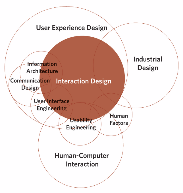
The process of interaction design involves studying the behavior and structure of interactive systems and implementing them for developing useful digital products. In other words, interaction design is the relationship between user and product and the services they use.
The purpose of interaction design is to create a great user experience. That’s why most of the UI disciplines require understanding and hands-on experience of interaction design principles. After all, it’s about designing for the entire interconnected system: the device, interface, context, environment, and people. Interaction designers strive to create meaningful relationships between people and the products and services they use. It may include computers, mobile devices, gadgets, appliances, and more.
It is important to understand ux design best practices while developing complex web and mobile applications. These are the key elements that product designers should not neglect while creating an interface for the user.
The 10 most important interaction design principles are-
By matching the sequence of steps, layout of information, and terminology used with the expectation and prior experiences of the users, designers can reduce the friction and discomfort of learning a new system.
You can match your audience’s prior experiences and expectations by using common conventions or UI patterns, for example, Hitee Chatbot.
Along with matching people’s expectations through terminology, layout, and interactions, the design should be consistent throughout the process and between related applications.
By maintaining consistency, you are helping users learn more quickly. You can re-apply their prior experiences from one part of an application to another to maintain consistency throughout the design. Design consistency is also an aid to intuitive interfaces.
Bonus – you can use the inconsistencies to indicate to users where things might not work the way they expect. Breaking consistency is similar to knowing when to be unconventional.
“Everything should be made as simple as possible, but no simpler.”
Albert Einstein
The range of possible actions should be no more than is absolutely necessary. Providing too many options will detract the primary function and reduce usability by overwhelming the user with choices. To achieve the Zen of functional minimalism, you should-
Cognition refers to the “process of thoughts.” A good user interactive design minimizes the user’s “effort to think” to complete a task. Another way to put this is that a good assistant uses his skills to help the master focus on his skills.
For instance, while designing an interactive interface, we need to understand how much concentration a task requires to complete it. Accordingly, you can design the UI that reduces the cognitive load as much as possible.
Here’s a technique to reduce users’ “thinking work.” Focus on what the computer is good at and build a system that utilizes its abilities to the fullest. Remember, computers are good at-
The point is – by knowing the attributes of users and products, one can create a design for a better user experience.
In terms of user experience, engagement is the measure of the extent to which the user has a positive experience with your product. An engaging experience is not only enjoyable but also easier and productive. Engagement is subjective to the system. I.e. your design must engage with the desired audience. For instance, what appeals to teenagers might be irrelevant to their grandparents. Apart from aligning your design for the appropriate audience, achieving and creating control is the key.
The interaction design principles state that users should always feel like they’re in control of the experience. They must constantly experience a sense of achievement through positive feedback/results or feel like they’ve created something.
In his book “Flow,” Mihaly Csikszentmihalyi describes a state of optimal experience where people are so engaged in the activity that the rest of the world falls away. Flow is what we’re looking to achieve through engaging interactions. We should allow users to concentrate on their work and not on the user interface. In short, stay out of the way!
Good interaction design should incorporate control, trust, and explorability to any system. If users feel in control of the process, they’ll be more comfortable using the system. If the user is comfortable and in control, they’ll trust the system and believe that the application will prevent them from making an unrecoverable error or from feeling stupid. Trust inspires confidence and with confidence, the user is free to explore further. Intuitive interfaces are extremely good at stimulating users to navigate and explore the app.
People are aware of the opportunity to interact with interactive media. As interface designers, we must avoid developing hidden interactions, which decrease the usability, efficiency, and user experiences. In other words, people should not have to guess or look for opportunities to interact.
When developing interactive media, users should have the ability to review an interface and identify where they can interact. We must remember that not everyone experiences and interacts with interface in the same way others do. In the process of interaction design, make it a habit to provide hints and indicators like buttons, icons, textures, textiles, etc. Let the user see that these visual cues can be clicked or tapped with their fingers. Always consider the usability and accessibility of the interactive media and how the user sees and perceives the objects in the interface.
Another important interaction design principle is inducing the ability to learn to use the interface easily. In other words, users should be able to learn to use the interface in the first attempt and should not face issues using it again. Please note that engaging interfaces allow users to easily learn and remember the interactions.
Even though simple interfaces may require a certain amount of experience to learn, learnability makes interaction intuitive. People tend to interact with an interface similar to other interfaces. This is the reason why we must understand the process of interaction design thoroughly and the importance of design patterns and consistency.
Intuitive interface design allows users to learn to use the interface without much effort and gives them a sense of achievement. They feel smart and capable of grasping and utilizing newer interfaces. In a nutshell, product designers should let the user feel confident while navigating through the interface.
The best way to reduce the number of errors a user makes is to anticipate possible mistakes and prevent them from happening in the first place. If the errors are unavoidable, we need to make them easy to spot and help the user to recover from them quickly and without unnecessary friction.
Error prevention techniques-
How to handle application errors through design?
Anticipate possible errors and provide feedback that helps users verify that-
Please note that providing feedback by changing the visuals of the object is more noticeable than a written message.
Error recovery techniques –
If the error is unavoidable, provide direction to the user to recover from it. For example, you can provide “back,” “undo,” or “cancel” buttons.
If a specific action is irreversible, you should flag it “critical” and make the user confirm first to prevent slip-ups. Alternatively, you can create a system that naturally defaults to a less harmful state. For example, closing a document without saving it should be intelligent enough to know the unlikely behavior of the user. It can either auto-save or display a warning.
Affordance is the quality of an object that allows an individual to perform an action. For example, a standard household light switch appears innately clickable.
The point is – users should get a clue about how to use an abject through its physical appearance. While designing user interfaces, you can achieve affordance either by simulating ‘physical world’ affordances (e.g. buttons or switches) or keeping consistency with web standards and interface design elements (e.g. underlined links or default button styles). The thing is, in an intuitive interface, users are able to navigate and use the functionalities of the application without any formal training.
Interaction design is not always about creating a better interface for the users; it is also about using technology in the way people want. It is necessary to know the target users to design a desirable product for them. Interactive design is the basis for the success of any product. These 10 interaction design principles are based on the study and experiences of our team in designing mobile and web apps for a broad product portfolio and on multiple mobile and web platforms.
Drop us a word at hello@mantralabsglobal.com to learn more about our interaction design projects and services.
Knowledge thats worth delivered in your inbox
Smart Manufacturing starts with real-time visibility.
Manufacturing companies today generate data by the second through sensors, machines, ERP systems, and MES platforms. But without real-time insights, even the most advanced production lines are essentially flying blind.
Manufacturers are implementing real-time dashboards that serve as control towers for their daily operations, enabling them to shift from reactive to proactive decision-making. These tools are essential to the evolution of Smart Manufacturing, where connected systems, automation, and intelligent analytics come together to drive measurable impact.
Data is available, but what’s missing is timely action.
For many plant leaders and COOs, one challenge persists: operational data is dispersed throughout systems, delayed, or hidden in spreadsheets. And this delay turns into a liability.
Real-time dashboards help uncover critical answers:
By converting raw inputs into real-time manufacturing analytics, dashboards make operational intelligence accessible to operators, supervisors, and leadership alike, enabling teams to anticipate problems rather than react to them.
Line performance and downtime trends
Track OEE in real time and identify underperforming lines.
Predictive maintenance alerts
Utilize historical and sensor data to identify potential part failures in advance.
Inventory heat maps & reorder thresholds
Anticipate stockouts or overstocks based on dynamic reorder points.
Quality metrics linked to operator actions
Isolate shifts or procedures correlated with spikes in defects or rework.
These insights allow production teams to drive day-to-day operations in line with Smart Manufacturing principles.
Role-based dashboards
Dashboards can be configured for machine operators, shift supervisors, and plant managers, each with a tailored view of KPIs.
Embedded alerts and nudges
Real-time prompts, like “Line 4 below efficiency threshold for 15+ minutes,” reduce response times and minimize disruptions.
Cross-functional drill-downs
Teams can identify root causes more quickly because users can move from plant-wide overviews to detailed machine-level data in seconds.
Data lakehouse integration
Unified access to ERP, MES, IoT sensor, and QA systems—ensuring reliable and timely manufacturing analytics.
ETL pipelines
Real-time data ingestion from high-frequency sources with minimal latency.
Visualization tools
Custom builds using Power BI, or customized solutions designed for frontline usability and operational impact.
Mantra Labs partnered with a North American die-casting manufacturer to unify its operational data into a real-time dashboard. Fragmented data, manual reporting, delayed pricing decisions, and inconsistent data quality hindered operational efficiency and strategic decision-making.
As this case shows, real-time dashboards are not just operational tools—they’re strategic enablers.
(Learn More: Powering the Future of Metal Manufacturing with Data Engineering)
| Aspect | What You Should Know |
| 1. Why Static Reports Fall Short | Delayed insights after issues occur Disconnected systems (ERP, MES, sensors) No real-time alerts or embedded decision logic |
| 2. What Real-Time Dashboards Enable | Track OEE and downtime in real-time Predictive maintenance using sensor data Dynamic inventory heat maps Quality linked to operators |
| 3. Dashboards That Drive Action | Role-based views (operator to CEO) Embedded alerts like “Line 4 down for 15+ mins” Drilldowns from plant-level to machine-level |
| 4. What Powers These Dashboards | Unified Data Lakehouse (ERP + IoT + MES) Real-time ETL pipelines Power BI or custom dashboards built for frontline usability |
Smart Manufacturing dashboards aren’t just analytics tools—they’re productivity engines. Dashboards that deliver real-time insight empower frontline teams to make faster, better decisions—whether it’s adjusting production schedules, triggering preventive maintenance, or responding to inventory fluctuations.
Explore how Mantra Labs can help you unlock operations intelligence that’s actually usable.
Knowledge thats worth delivered in your inbox


Our Sales Team will be in touch with you shortly.

Hello Stranger! Please fill in a few details,and you’ll receive a link to this case study.
 We have mailed you this case study.
Thanks for subscribing.
