


Published on May 6, 2019
Updated on Oct 16, 2019
Create superior customer experiences to enhance competitive advantage.
Go from zero to breakthrough with scalable, future-proof solutions.
Harness deep tech for smarter solutions and maximum impact.
Accelerate value delivery with powerful pre-built digital tools.
Help businesses connect with an internet first generation.
Test the smarter way: where precision meets efficiency.
Unlock real-time and personalized customer journeys for mobile first generation.
Turn data into decisive action with scalable AI infrastructure.
Design agile digital foundations that scale with tomorrow's business needs.
Build new-age architecture for maximum efficiency and hyper-growth.
Fine-tune your cloud infrastructure for peak performance.

All
Customer Experience
Mantra
Application Development
Insurtech
Digital Health
Insurance
Deep-Tech
AgriTech(1)
Augmented Reality(21)
Clean Tech(9)
Customer Journey(17)
Design(45)
Solar Industry(8)
User Experience(68)
Edtech(10)
Events(34)
HR Tech(3)
Interviews(10)
Life@mantra(11)
Logistics(6)
Manufacturing(3)
Strategy(18)
Testing(9)
Android(48)
Backend(32)
Dev Ops(11)
Enterprise Solution(33)
Technology Modernization(9)
Frontend(29)
iOS(43)
Javascript(15)
AI in Insurance(39)
Insurtech(67)
Product Innovation(59)
Solutions(22)
E-health(12)
HealthTech(24)
mHealth(5)
Telehealth Care(4)
Telemedicine(5)
Artificial Intelligence(153)
Bitcoin(8)
Blockchain(19)
Cognitive Computing(8)
Computer Vision(8)
Data Science(23)
FinTech(51)
Banking(7)
Intelligent Automation(27)
Machine Learning(48)
Natural Language Processing(14)
There is no ‘good’ or ‘bad’ in design. But, there are right choices that you can make to strike the right balance. The right choices always revolve around the balancing of elements and how to go about incorporating them into your design. Design is largely intrinsic, something that depends on how you look at it.Utilizing strong design principles will go a long way in transforming your UX desgin for your users.
But, how do I improve it?
The vital ingredient of any design is a discernable pattern. Patterns are universally observed, and by incorporating the right examples in your designs, it can evoke a desired reaction or response to a specific interaction. So the challenge is to decide – how do you want the user to perceive the design while simultaneously solving the usability problem.
Let’s look at some simple steps.
Hierarchy
This is level zero. By setting visual hierarchy, you are communicating to the end-user where to look first. The entire sequence, along the visual journey, has to be laid out first. For example: making an element bigger to draw the attention and set a focal point for the user. Hierarchy can also be set by using white space or bright colours to highlight crucial parts of your interface.
In Fig A, the design has all the information laid out for the user, but it’s set in no particular hierarchy, meaning there is no indication of what is important and what is less important, so a user can feel lost in the visual journey of what message the design actually intended to say.


Fig A Fig B
In Fig B, by using intentional white space, we bring the most important message to the fore – so what a user sees first is that the game night is between who, where and when, and everything else is kept secondary to it.
Keeping things simple and consistent
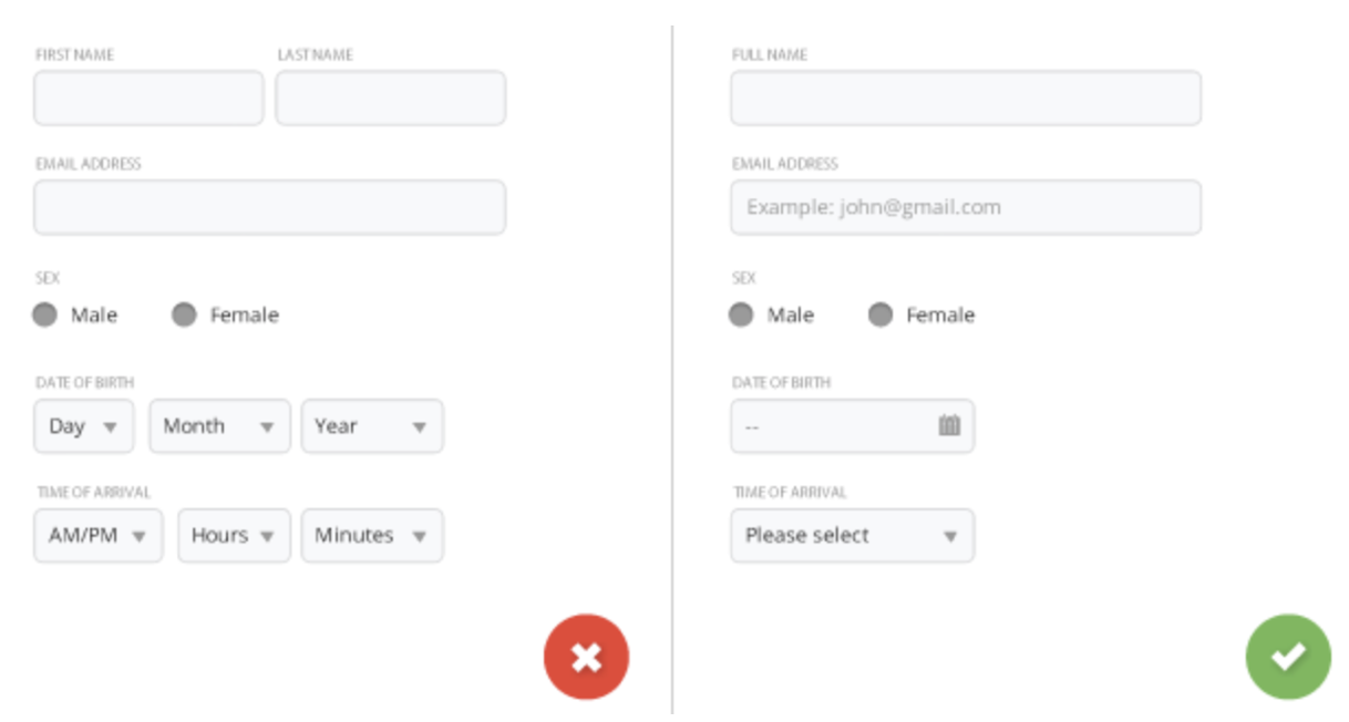
By keeping the elements in your design minimal, placing them in your layout will be easier to manage – making it easy for users to navigate through your design. Too many elements in one design can be off-putting and confusing to look at. Consistent use of elements is a better approach, that usually sets the users mind at peace – like the style of a button or the placement of a close button. In this way you are guiding the users on what to see first and where to click next. Interaction consistency is also as important as visual consistency. Always try to minimize the number of ‘clicks’ in your design – no one likes to engage in redundant clicks to get quick information.
In the examples below, the design on the right can be improved by simply reducing the number of clicks from 10 clicks to 5, by reducing redundancies in the information design.
Mind the space
Spacing is vital for great composition. Using whitespace and negative space correctly, plays a crucial role in your design. It is just like your living room, when you decide what to keep in a particular area and where to leave space – the same applies to your design also. For example, when there is only a line or two of text, try to put the text in the one-third
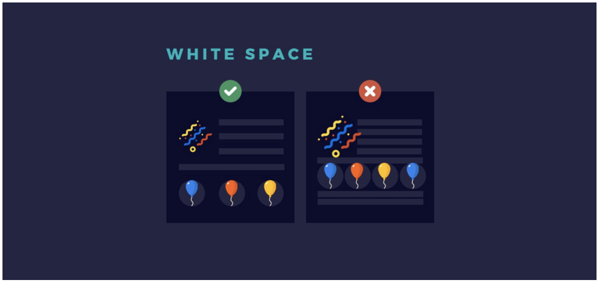
of your art-board either from top or bottom. If however, there is more text to work with try to group them and set the hierarchy by increasing or decreasing spacing between each group. By incorporating enough white space in your design, there will be sufficient breathing area for users to relax their eyes into.
White space is not just empty space. It’s about creating enough room for your text and design elements to co-exist.
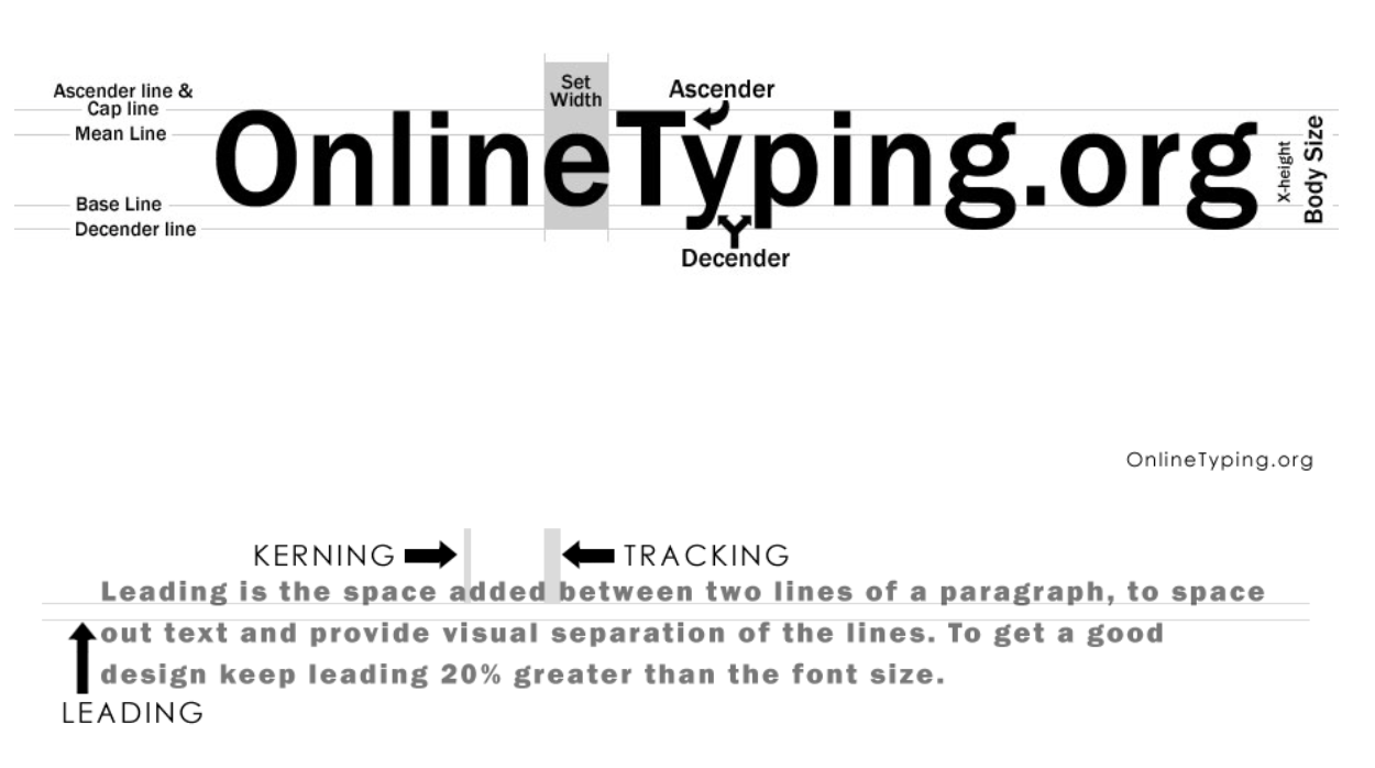
Typography
Sensible use of typography can really enhance your design. Selecting the right typography involves certain decisions that include a choice of font family, weight & size, leading, tracking, kerning and scale. Avoid using too many fonts from different font families. Instead, use one or two font family and play around with font weight and size to find what works best for your design. Also remember, If no one can read the text on your design, it defeats the purpose of putting all that effort into your designs. Lastly, avoid using font colour which may clash with your background colour For example, ‘Red’ text on an Orange background, is an extreme choice.
Contrast
Emphasizing certain elements of your design is both visually appealing and functional. Finding the right color mix for temperature, saturation, hue, and intensity can help you set hierarchy for the elements you want to bring out in your design. However, contrast isn’t just a colour thing. It also involves shapes, edges, textures, scaling, and size. Albeit, like with almost any other design concept, it can be overdone. You should make sure that the contrast in your design isn’t so dramatic that it’s jarring unless that’s your specific intent.
Not a good way to use contrast
A more balanced contrast
Balance the Elements
This is where you draw the line between your design and your users. A design is not useful if it doesn’t solve a problem. Likewise, it is also not so useful if the user didn’t get the message right. Information is important to get across – it should have a higher priority in your design approach and draw the user’s attention first.
In the images below, the content is the same but what makes the right image better is the complete balancing of all the elements, relaxing the design using appropriate spacing and placement without overwhelming the user with all that textual information.
Making the right design choices for enhancing a user’s experience is all about creating a seamless link between the user and the applications they use. Every designer has their own style and while these design principles are important to consider – it’s more important to stay original and keep practicing.
Knowledge thats worth delivered in your inbox
In healthcare, field sales is more than just hitting quotas—it’s about navigating a complex stakeholder ecosystem that spans hospitals, clinics, diagnostics labs, and pharmacies. Reps are expected to juggle compliance, education, and relationship-building—all on the move.
But, traditional systems can’t keep up.
Only 28% of a rep’s time is spent selling; the rest is lost to administrative tasks, CRM updates, and fragmented workflows.
— Salesforce, State of Sales 2024
This is where mobile-first sales apps in healthcare are changing the game—empowering sales teams to work smarter, faster, and more compliantly.
Despite their scale, many healthcare sales teams still rely on outdated tools that drag down performance:
According to a study by HubSpot, 32% of reps spend at least an hour per day just entering data into CRMs.
These issues don’t just affect productivity—they erode trust, delay decisions, and increase revenue leakage.
According to Deloitte’s 2025 Global Healthcare Executive Outlook, organizations are prioritizing digital tools to reduce burnout, drive efficiency, and enable real-time collaboration. A mobile-first sales app in healthcare is a critical part of this shift—especially for hybrid field teams dealing with fragmented systems and growing compliance demands.
Field reps can plan high-impact visits, reduce travel time, and log interactions efficiently. Geo-tagged entries ensure field activity transparency.
According to Viseven, over 60% of HCPs prefer on-demand digital content over live rep interactions, and self-detailing can increase engagement up to 3x compared to traditional methods.
By enabling self-detailing within the mobile app, reps can deliver compliance-approved content, enable interactive, personalized detailing during or after HCP visits, and give HCPs control over when and how they engage.
Track escalation tickets and incentive eligibility on the go, reducing back-and-forth and improving rep satisfaction.
Push product updates, training videos, and compliance checklists—directly to reps’ devices. Maintain alignment across distributed teams.
Sales leaders can view territory-wise performance, rep productivity, and engagement trends instantly, enabling proactive decision-making.
Mantra Labs partnered with a top Indian pharma firm to streamline pharmacy workflows inside their ecosystem.
These challenges not only disrupted the pharmacy workflow but also created a ripple effect across the wider care delivery ecosystem.
We designed a custom digital pharmacy module with:
A mobile-first sales app in healthcare is as strong as the ecosystem it fits into. Mantra Labs ensures seamless integration with:
From lead capture to conversion, Mantra Labs helps you automate, streamline, and accelerate every step of the sales journey.
Whether you’re managing field agents, handling complex product configurations, or tracking customer interactions — we bring the tech & domain expertise to cut manual effort and boost productivity.
Let’s simplify your sales workflows. Book a quick call.
Further Reading: How Smarter Sales Apps Are Reinventing the Frontlines of Insurance Distribution
Knowledge thats worth delivered in your inbox


Our Sales Team will be in touch with you shortly.

Hello Stranger! Please fill in a few details,and you’ll receive a link to this case study.
 We have mailed you this case study.
Thanks for subscribing.
