Published on Mar 8, 2016
Updated on Apr 17, 2020
Our Expertise ![]()

All
Customer Experience
Mantra
Application Development
Insurtech
Digital Health
Insurance
Deep-Tech
AgriTech(1)
Augmented Reality(20)
Clean Tech(6)
Customer Journey(12)
Design(37)
Solar Industry(7)
User Experience(57)
Edtech(10)
Events(34)
HR Tech(2)
Interviews(10)
Life@mantra(11)
Logistics(5)
Strategy(17)
Testing(9)
Android(47)
Backend(30)
Dev Ops(7)
Enterprise Solution(27)
Technology Modernization(2)
Frontend(28)
iOS(43)
Javascript(15)
AI in Insurance(35)
Insurtech(63)
Product Innovation(49)
Solutions(19)
E-health(10)
HealthTech(22)
mHealth(5)
Telehealth Care(4)
Telemedicine(5)
Artificial Intelligence(132)
Bitcoin(8)
Blockchain(19)
Cognitive Computing(7)
Computer Vision(8)
Data Science(17)
FinTech(50)
Banking(7)
Intelligent Automation(26)
Machine Learning(47)
Natural Language Processing(14)
The mobile phone has rapidly become the most widely used technology in the world. It is getting far more common than traditional computers. The statistic forecast that the total number of smartphone users worldwide by 2020 would be 6.1 billion, according to the annual Mobile Report from Ericsson.
The statistics show every year brings to the fore more in the realm of business access via mobile apps. The impact of a smartphone for business is undeniable. From smartphones to tablets, the ways to look up products and research via mobile apps are increasing at an alarming pace and it’s better to stay ahead than be left in the dust.
The rule of the game is simple: you’ve got to get—and hold—the attention of your consumers. And hold it long enough until they’ve paid for your product or services.
With mobile being front and center more than ever, designers are looking to perfect their mobile-design skills for their clients and customers. They have to prioritize the user experience when designing mobile apps, and designing native mobile apps that offer a richer experience than mobile web apps is the way to go.
The top trends that Mobile Design holds for 2016 are:
1- Increasing Wearable Influence
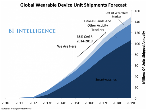
Wearables have taken concept of mobile to a whole new dimension. According to the Gartner’s prediction of 2016 wearables market, there will be 50.4 million units sold in wearable market, which is an 18.4% increase from 2015 sales.
Not only is the screen smaller than a traditional mobile device, but wearables also encourage people to use mobile technology in different scenarios than smartphones and tablets, leading to necessary changes in the user interface.
For instance, the way you’d tap the screen of a smartphone to open a native news app is different to how you’d have to reach over with one hand to touch your Apple Watch to use its features.
As a result, 2016 will see designers and developers race to create intelligent, user-friendly wearable apps that are unique to this type of mobile device.
2- Multi-app Split Screen
Multi-app Split Screen allows you to do two things at once on your screen. It means, if you are on your Evernote native mobile app, you can email at the same time or tweeting and can look something up on the Internet simultaneously. The convenience is beyond amazing, as it saves the time and trouble of tapping the home button, and then constantly switching between two (or more) open app windows.
It’s clear that impressive features such as split-screen capability have made all the difference to consumers.
With Android fans clamoring for, and wondering when Google is finally going to introduce the mobile split-screen feature on its devices. Google seems to already be making baby steps toward this right now, so it’ll be interesting to see what they come up with later this year.
The time also seems right for designers and developers to focus their efforts on finally producing split-screen multitasking for Android.
3- Surge in Native and Mobile Web Apps
For some time, there’s been a dispute over what type of mobile app works best: native mobile apps that you open by tapping on your smartphone’s home screen or mobile web apps that you access from mobile versions of browsers.
Designers and developers would argue that native apps are superior because they are faster for the users, can be monetized in places like the App Store, and offer users access to mobile operating system features like the camera, contact lists, etc. That’s definitely true!
However, recent research by Google’s product director, Luke Wroblewski, indicates that there’s great demand for both types of apps, in spite of the apparent limitations of mobile web apps. According to his data, native app users spend 18 times longer on native apps than on mobile web apps…yet mobile web apps see almost 9 million monthly visitors compared to native apps’ 3.3 million monthly visitors.
Therefore, mobile audience growth is based on mobile websites, so developers will have to continue serving that market with mobile web apps, too, while continuing to prioritize mobile native apps that have a better UX. 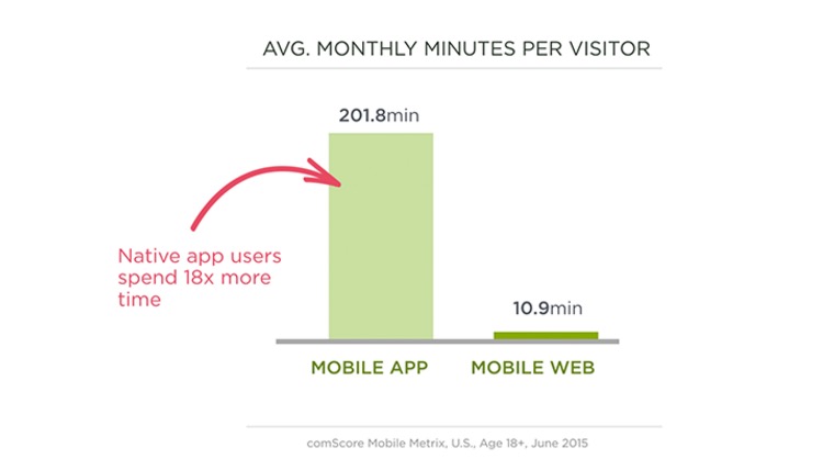
4- Better UI for Gestures
What’s a gesture? In mobile design, it’s divided into two groups, according to Google:
For example, if I tap on my iPhone’s native mobile mail icon, I’ve produced a touch mechanic, that in turn creates the ensuing touch activity, which is my inbox opening.
With projections of smartphone users at more than 6 billion globally by 2020, it’s high time that designers design UIs to better accommodate a range of mobile gestures.
Touch mechanics include:
Some native mobile apps, such as Starbucks, use an unappealing UI that makes, for instance, validating a free drink reward more cumbersome than it should be. If I have a free drink, I have to actually shake my phone by using my entire hand to get the barcode to appear on the screen for it to be validated.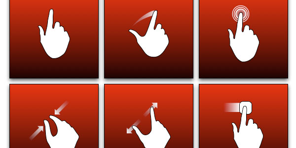
5- Material Design Captivates the Mobile Design Community.
Material Design is not completely flat anymore because it uses techniques like gradients, shadows and other subtle, 3D effects. As a result, this slightly different approach to native mobile design has people excited because it’ll drastically improve the UX on mobile devices.
Unsurprisingly, Google will be a big player in influencing native mobile design trends this year. Beyond mobile, Google’s Chrome browser is also set to incorporate material-design touches in its interface, and Google is all set to unveil its new material design-influenced Chrome browser soon.
Though material design was slow to be adopted to various Android apps last year— we’re talking Gmail, YouTube, Google Maps—that’s changing in 2016, as more native apps from companies outside of Google join the material-design bandwagon.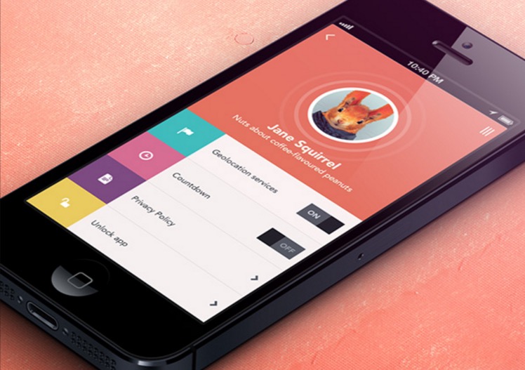
6- Moving Animation
People are naturally programmed to take notice of movement, so incorporating movement into a mobile design can be the perfect way to highlight a specific product. This makes moving animation a superb tool for e-commerce sites. This also has a secondary, more useful purpose: Letting users move products around on the screen before they buy it makes it easy for them to inspect it from all sides…almost as if they were in a real, tactile store.
With Web Designer Depot proclaiming that “animation is no longer a novelty for web designers…it’s becoming the basis of effective interaction design,” moving animation is set to take off in a large way this year as designers increasingly realize that movement helps tell a story, and that helps the UX.
Bugaboo’s mobile site features moving animation that lets customers examine its popular strollers from all sides, which beats merely looking at still pictures to make a buying decision.
7- Micro-interactions Become More Prevalent
Micro-interactions are focused on the UX of a native mobile app. They’re subtle tasks that work around four elements.
For example, Slack is an awesome native mobile app that is replete with great micro-interaction examples.
I tap the “plus” sign next to Direct Messages. This is the trigger because it starts the micro-interaction. Now, I get to communicate directly with my Slack collaborator, which forms the rules or the way the interaction functions. How do I know this? Because, thirdly, the feedback Slack gives me on-screen shows a “New Conversation” box opening up, where I can chat directly with her. Finally, the length of this micro-interaction—or loop—is as long as I want it to be, as I can close the new message when I want to.
As you can see, these micro-interactions let people instantly observe the results of their on-screen actions by providing helpful and understandable feedback. This greatly improves the UX. As more designers see this innate value to users, micro-interactions will get more widespread.
8- Subdued Color Contrast
You’ve probably been taught that contrast should be high and loud to facilitate an easier reading experience, but 2016’s mobile design trends go against the mainstream conventional wisdom by toning things down a bit.
The usual typography contrast is black font on a white background—there are even various color-contrast calculators on the web (like Contrast Ratio) to help you find good contrast for readability.
In 2016, though, contrast will get less loud and more subtle, which is actually easier on the user’s eyes and facilitates a better reading experience. Some of the biggest websites in the world are already moving to this subdued form of color contrast.
9- Flat Design 2.0 Begins to Replace Flat Design
One of the few, but big, criticisms of flat design is the lack of signifiers on things like icons and buttons, which fail to adequately communicate functional design elements. This has a negative impact on UX since what users can click and tap isn’t necessarily obvious at first.
This might not seem like a big deal to veteran users, but the point of good native mobile design—mobile and otherwise—is to make the UX easy enough that even novice users can find their way around your native app or mobile website.
Flat design 2.0 is like Material Design in a sense because both use more 3D effects like shadows, gradients and lighting effects. However, whereas Material Design is more of an aesthetic and design philosophy based on paper and ink (read: tactile elements), flat design 2.0 is an actual response to and way of addressing flat design’s shortcomings.
One should look for more mobile sites and apps to retain the flat look, but with noticeable shading to indicate subtle 3D elements. These will make it easier for users to figure out where to tap and slide, such as Android Evernote’s native mobile app above.
10- Increased Tracking in Typography
So much of the mobile web today deals with readability. One of the most important aspects of readability is tracking, or the consistent space between all letters in a word. The greater the tracking, the easier the word is to read because users don’t have to squint to read the word.
With the big focus on native mobile usability, designers need to look at increasing the readability of their content.
Typography authority Typewolf released its list of “the most popular fonts of last year”, and the big trend is spacious and generous tracking between letters of the most popular fonts, which will continue into 2016. With Gartner predicting the number of mobile devices increasing in 2016, readability is going to be increasingly vital to UX designs that will attract native mobile app users in even greater numbers.
11- The Grand Scheme of Interactive Designs
his one means we’ve started to see apps focused around users. The challenge to draw in more and more users has given birth to interaction designs. This, of course, entails the integration of interactive elements to lure consumers with an interesting, powerful and creative visual story. This kind of design’s got punch, we’ll give you that.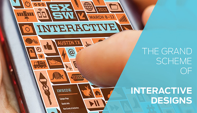
Conclusion
Look for these trends to dominate the native mobile landscape as the year progresses. It’s clear that now is the time of mobile, as evidenced by mobile users now completely outweighing desktop users…. Don’t hold your breath waiting for these stats to reverse.
With this focus on mobile, it’s no surprise that the design community is looking for increasingly interesting designs to improve the UX and get people on native mobile with greater comfort than ever.
What do you think of this list of mobile design trends? Are there any we left off? If you think there are, please email us at hello@mantralabsglobal.com
Check out these articles to catch the latest trends in mobile apps:
Knowledge thats worth delivered in your inbox
Interfaces are everywhere. The user experience encompasses the overall experience a user has while interacting with a product or service. Animation, in the context of UI and UX design, involves adding motion to these visual elements to create a more engaging and intuitive user experience. Animation may serve a functional purpose by guiding users or providing feedback.
Think of motion as a design tool in your UX journey. It should help achieve the user’s goals or contribute in some way to enhance the experience. Animation shouldn’t be distracting or excessive. In other words, if it gets in the way of the user accomplishing a task or takes up more seconds for what should be a quick task, then it becomes unnecessary and annoying.
One common example of animation in UI design is the loading spinner. Instead of staring at a static screen while waiting for a page to load, a spinning animation lets users know that something is happening in the background. This simple animation helps manage user expectations and reduces frustration.
Introducing animations to the interface serves a psychological purpose as well. One aspect involves ensuring users remain informed throughout their interaction, minimizing ambiguity. Uncertainty can lead to user anxiety; for instance, if a page is loading without any interface feedback, incorporating a micro animation can be beneficial in providing reassurance. Although not all problems may need animations, adding them increases their appeal.
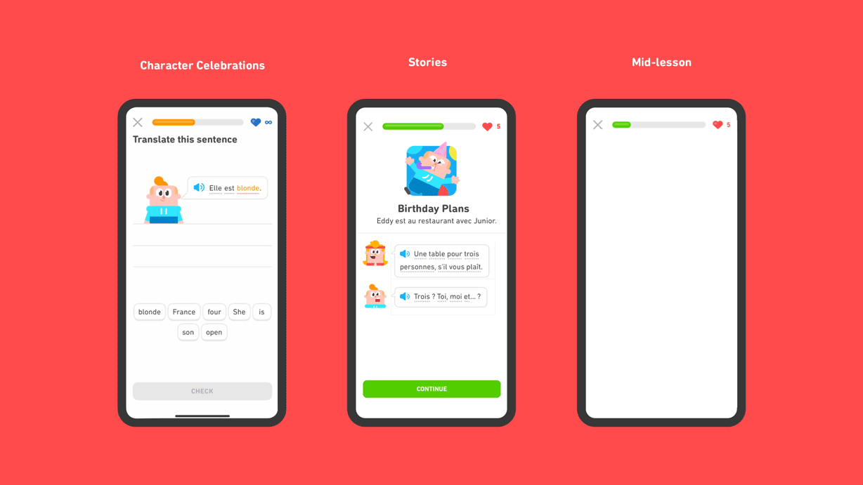
In recent years, several applications have pushed the boundaries of animation in UI and UX design. One notable example is the Duolingo app, which uses playful animations and interactive elements to make language learning fun and engaging. Interactive animations can gamify the user experience, making mundane tasks more engaging and Duolingo has used this to its advantage. Another example is the Headspace app, which employs calming animations and transitions to create a serene user experience.
Let’s look at Duolingo’s application which embraces animation to engage the user’s attention. It keeps users hooked and gives them the comfort of gamification. This not only makes the information more visually appealing but also helps users quickly understand the current stage. It keeps the user hooked throughout the level with its cute animations.
Credits: Kim Lyons
Additionally, captivating animations can also serve to promote and enhance the appeal of your product.
Micro-animations extend beyond just the gamification of applications; they can also be leveraged to enrich the aesthetics and express the essence of your product. They contribute to making your website feel more alive and interactive, elevating the overall user experience.
In essence, animation in UI and UX design is not merely about adding visual flair, it’s about creating meaningful interactions that enhance user engagement and satisfaction. From improving usability to expressing brand identity and personality, animation has the potential to transform digital interfaces into dynamic and memorable experiences. Whether it’s guiding users through a process or providing feedback animation, it has the power to elevate the overall user experience. Next time you witness animation appreciate the magic that brings it to life, you might just be amazed by its impact.
About the Author:
Shivani Shukla is a Senior UI & UX designer at Mantra Labs. It’s been a while since she started her journey as a designer. Updating her knowledge and staying up to date with the current trends has always been her priority.
Knowledge thats worth delivered in your inbox

Subscribe! to read our latest stories, perspectives and case studies.
We’ll keep you updated monthly, on the fantastic products we build for Enterprises.

Our Sales Team will be in touch with you shortly.

Hello Stranger! Please fill in a few details,and you’ll receive a link to this case study.
 We have mailed you this case study.
Thanks for subscribing.